


Your chest mark went out as a PNG and came back with fuzzy edges. Or you built a full-back graphic at 12 inches, shrank the same art for a left-chest run, and watched the counters in the letters fill in on the first press. Neither problem is the printer's fault.
Both come from the same decision made months earlier, when the art was created. A t shirt design vector master, built properly, gives you one file that survives every size, every garment color, and every print method. A stretched screenshot doesn't, no matter what extension you rename it to.
Three choices settle the rest. Whether the art in front of you should be vector at all. How a vector file differs from the PNG sitting in the same folder. And what prep each production method demands before you upload.
When a Shirt Graphic Needs a Vector Master
A two-person shop takes a brewery order: 40 tees, the same mark on the left chest and across the back. One piece of art, two placements, and a reorder likely next season. If that art exists as paths, a single master covers all of it, at any size, for years. If it exists as a 900-pixel JPG pulled from the brewery's website, the shop needs two separate raster files at two different resolutions, and neither one can be enlarged again without falling apart.
That's the whole argument for a vector master, and it isn't new thinking in design software. SVG, the format behind most web-facing vector art, had its first public working draft published by the World Wide Web Consortium on February 11, 1999, and the specification reached Recommendation status on September 4, 2001. The industry spent more than two decades agreeing on how paths, curves, shapes, and text should be described so a file would render the same way on any device. You inherit that stability every time you build artwork as geometry instead of pixels.
Before you draw anything, run one test:
- Mostly shapes and type that must change size. Build a vector master. Logos, wordmarks, icons, flat illustration, badge layouts.
- Mostly photograph or heavy texture. Build a high-resolution raster at the final print size instead. A skyline photo or a painted portrait gains nothing from being a path file.
- A mix of both. Build the shapes as vectors and place the continuous-tone element as a raster at the size it will print. More on that split below.
A file extension won't sharpen soft art. The question is what the artwork is made of, not what you named it.
Vector Paths, Raster Pixels, and Scaling Limits
A format argument usually ends the moment someone asks what the artwork is made of. The table below maps that question. Find the art you have in the middle column and follow the row.
| Question | Vector artwork | Raster artwork |
|---|---|---|
| Built from | Mathematical paths, curves, and points | A fixed grid of pixels |
| Enlarging the art | Path art stays sharp at new sizes | Edges soften once you pass the original pixels |
| Best shirt art | Logos, type, icons, flat-color illustration | Photos, painterly art, textures, distressed photos |
| Common files | AI, EPS, PDF, SVG | PNG, JPG, TIFF, PSD |
| Hidden failure | Embedded photos, shadows, and textures still pixelate | File must be made at final print size, often 300 PPI |
Two ways to store a picture
Vector artwork is defined by mathematical coordinates, lines, curves, and shapes rather than a fixed grid of pixels, as Adobe's guide to vector file types explains. That structure lets a design be enlarged or reduced without becoming pixelated, which is what you need when the same mark has to run as a small left-chest logo and a large front graphic in the same order. AI, EPS, PDF, and SVG are the usual containers.
Raster files record a grid of colored squares, and the grid is locked at whatever size it was created or exported. Enlarging a raster adds no information. It spreads the existing pixels further apart and the edges go soft.
Adobe attaches a caveat that most how-to posts skip. The resolution-free advantage applies to the vector elements themselves; raster images embedded inside a vector file can still lose quality when enlarged. For production, confirm that lettering, logos, and illustrated elements are genuine vector paths, and convert live text to outlines so the file carries no font dependency. Artwork sitting inside a vector-format container is still artwork made of pixels.
The embedded raster trap
Drag a photograph onto an Illustrator artboard, save the file as an AI, and you've made a container, not a conversion. The same applies to a PDF built from a JPG, or a logo where the type is live text and only the icon is paths.
The W3C's technical overview of SVG makes the point from the format side. SVG renders independently of device resolution, so logos, lettering, and line art can scale from a small chest mark to a large back print without bitmap pixelation. Vector format alone still doesn't guarantee production quality. Embedded raster effects, photographs, shadows, and texture layers carry a fixed effective resolution, no matter how clean the surrounding paths look.
A PDF is a container, not a conversion. If a photograph went in, a photograph is what the printer receives.
The practical fix is a workflow rule: keep contours, type, and flat-color areas as paths, and check every raster element at its final physical size before the file leaves your machine. Vector artwork is the best starting point for printing, and a PNG with a transparent background works well as the export when a supplier asks for one, but only if that PNG was generated at the right dimensions.
Placement sizes that test the master
Say the job needs a chest version about 3.5 inches wide and a back version at 12 inches. Those two outputs pull on the same geometry in very different ways. A stroke that reads as a crisp two-pixel line in the small version becomes a thick slab in the large one, and a hairline that looks refined on screen may vanish or break at either size.
One master can feed both when the geometry is real. Keep the editable file as the master and treat every PNG or JPG as a copy made at a known print size, generated from that master. When someone asks for a bigger version later, you re-export rather than upscale.
Where geometry still fails on fabric
Mathematically valid vectors can still print badly. After a large scale change, inspect thin strokes, narrow counters inside a, e, and o, and small negative spaces. Pressing involves heat and pressure, and both can shift fine detail slightly on fabric, so geometry that is marginal on screen will not improve on a shirt.
This is also why one vector master is a starting point rather than a finished file. DTF, screen printing, DTG, and marketplaces that only accept a raster each want a different export, and the master has to be outlined and cleared of hidden pixels before any of them. The next two sections get specific about what each method can hold.
Color Setup and Lines Fabric Can Hold
That neon green that glows on your monitor is the first casualty. On a shirt it comes back olive, or a flat yellowish green, and nobody in the chain can explain why. The screen is mixing light. The print is putting pigment on fabric. Those are different substances, and the gap between them has to be managed deliberately rather than discovered at press time.
Set color for the process, not the screen
The ICC's white paper on flexible color management explains the mechanism. A PDF can associate color data with ICC profiles so colors are interpreted relative to imaging devices, and named spot colors can be represented through Separation or DeviceN color spaces with alternate CIELAB or CMYK definitions attached. That's the technical reason a properly tagged file travels better than a raw RGB export.
Before choosing colors, identify the output process. Use a documented CMYK profile when the workflow relies on process color. Preserve named spot colors when the method supports exact ink separation. Adobe's PDF/X-1a guidance, cited in the same paper, requires press-oriented files to contain CMYK or spot colors and to have transparency flattened, which removes guesswork downstream. Highly saturated RGB colors, especially neon greens, oranges, and blues, are the values most likely to compress or shift during conversion. If you're still fuzzy on which mode to start in, this breakdown of CMYK vs RGB covers when each one belongs in a print file.
Practical rule: export using the printer's stated profile, inspect separations, and confirm that black text is a real black rather than a four-color build of cyan, magenta, yellow, and black.
Where separations fall apart
Screen printing makes the reason visible. The Printing Industries of America guidance on art separations describes artwork divided into individual color separations, each printed as a separate positive and reproduced one color at a time. Registration, the alignment of one color over another, has to hold or you get visible gaps and unintended overlaps. The same guidance recommends setting print colors as spot colors rather than process builds when separations are required.
Two checks catch most failures. Look at adjacent color areas that touch: a tight gap between two inks is valid geometry and still shows the shirt through if registration drifts. And confirm that small knockout type inside a dark field has enough weight to survive, because knockouts are where a slight misalignment reads as a smudge.
Even full-color DTF, which doesn't need spot separations, benefits from organized color areas and intentional transparency. A stray semi-transparent pixel or an unfinished background shows up as a faint box on the film, and if that design goes onto a gang sheet next to five others, the problem multiplies.
Prepare the Master for Each Print Method
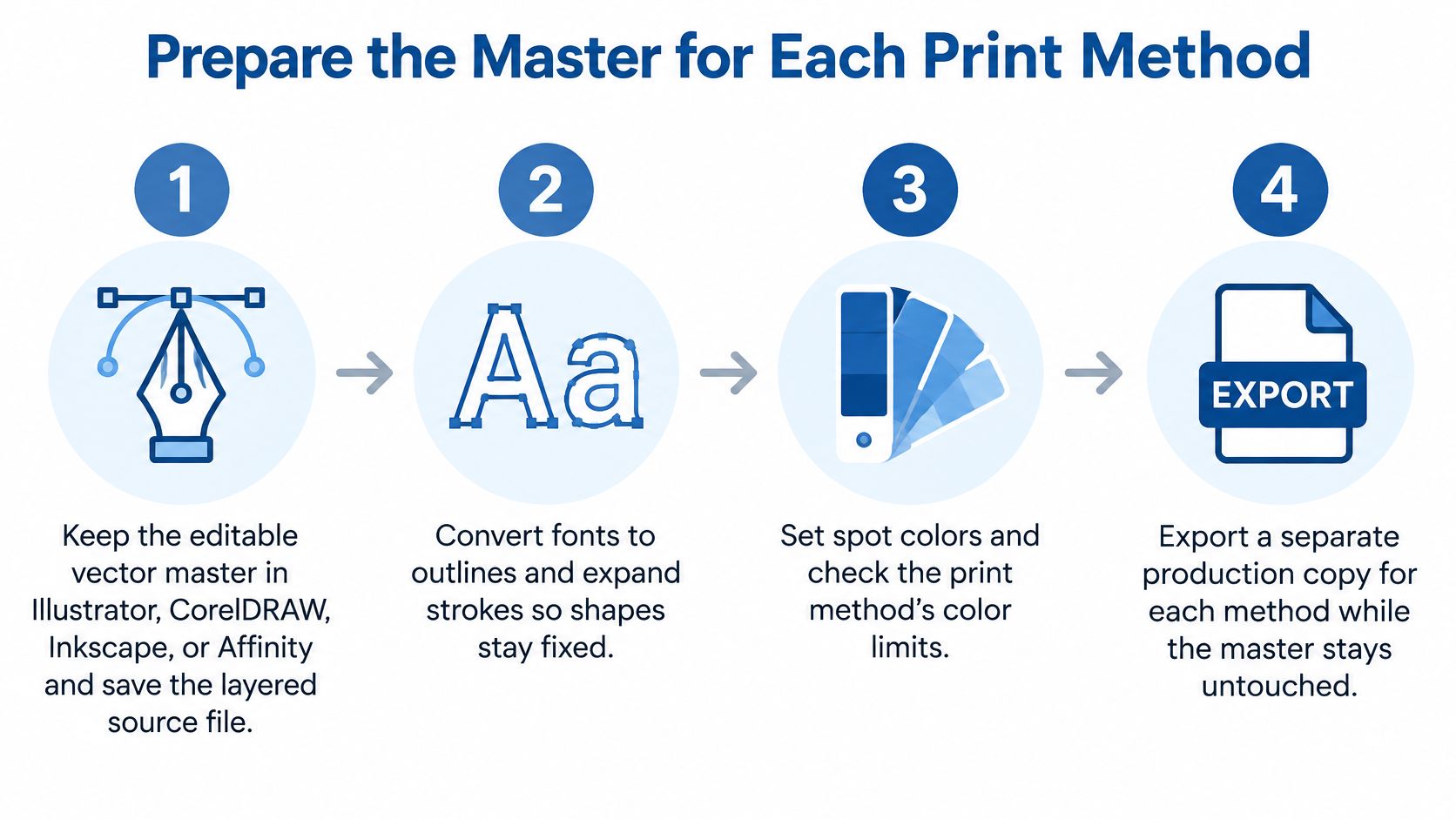
The single rule that prevents most production surprises: preserve the editable vector master, then export a production copy for each method. The master never leaves your machine. Everything the printer or marketplace receives is a derivative, exported on purpose.
That distinction matters because platform requirements conflict. As Shopify's shirt design guide notes, some merchandise platforms accept only JPG or PNG and require vector artwork to be rasterized at the final print size, while other suppliers want outlined fonts, expanded strokes, transparent backgrounds, and specific color handling. The same file cannot satisfy all of them, and treating "vector" as automatically print-ready is where small shops get caught.
The six prep steps
- Work in a real vector tool and save the native master. Illustrator, CorelDRAW, Inkscape, or Affinity. Keep the layered source file with live shapes so you can edit later.
- Convert text to outlines. A live font reference depends on that font being installed wherever the file opens. Outlining turns type into shapes, so a substitution can't wreck your spacing.
- Expand strokes and appearance effects. Line weight, arrowheads, and live effects can render differently on another machine. Expanding bakes them into geometry.
- Close paths, delete stray points and unused swatches, and place each design on its own artboard. Clean files preflight faster and cause fewer surprises at the printer's end.
- Audit photos, shadows, and textures. Either redraw them as vectors or accept them as rasters and confirm they hold up at final print size. This is the step people skip.
- Choose color for the method, then export that method's file. One master, multiple exports. Don't try to make one export serve DTF and screen printing at once.
Which file each process wants
Treat this as the branch, not as a second copy of the steps above. Once the master is clean, the method decides the export.
| Process | Master versus export | File to send | Check before you send |
|---|---|---|---|
| DTF heat transfer | Keep vector master; export at final inches | Transparent PNG, or printer-accepted PDF | No background, no stray semi-transparent pixels, strokes that survive heat |
| Screen printing | Keep vector with real spot colors | Outlined AI, EPS, or PDF | One separation per ink, registration, limited gradients |
| DTG | Rasterize at final print size | PNG near 300 PPI at print size | Photos are fine; type edges still come from the vector master |
| Marketplace upload | Often must flatten | JPG or PNG only on many platforms | Their max print area, since they will not use your live paths |
The checks after export
Open the exported file, not the master, and zoom to the smallest type. Look at the edges of thin strokes and any pixel that sits at partial transparency. Semi-transparent pixels are the usual cause of a faint halo around a logo on a dark shirt, and they're invisible at 100 percent zoom on a bright monitor.
If you're unsure whether your export suits a particular method, which file format is best for printing walks through the format-to-process matches in more detail. And remember that "infinite scalability" applies to the vector geometry. Embedded raster textures, shadows, and distressed effects scale up to nothing.
Designs That Stay Vector or Go Raster
Four jobs land on the bench in a normal week, and each one sorts differently.
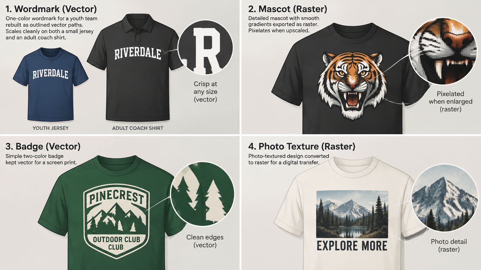
A one-color wordmark for a youth team and the coach's shirt. Rebuild the letters as paths, outline them, and scale the same master to roughly 3.5 inches for the chest and larger for the front. One file, two placements, no redraw. This is the easiest case and the one worth getting right first, because it trains the habit.
A three-spot mascot with flat fills. Keep it vector. Each color becomes its own separation, so you can recolor the same file for a light shirt and a dark shirt without redrawing anything, and screen printing stays clean.
A photograph of a skyline or a painted portrait. Leave it raster. Size the PNG to the final print inches at roughly 300 PPI and stop there. Tracing every pixel into thousands of tiny paths produces clutter that clogs a screen and prints as mush.
A vintage texture laid over clean type. Keep the words as vectors and place the distress as a raster at final size. Then preview the smallest letters, because a texture that knocks holes in the type can erase a thin stroke entirely.
Here's a walkthrough of the practical difference in how the two file types behave under editing and scaling.
One more case worth naming: a downloaded PNG logo with jagged edges. Auto-trace can rescue simple shapes, but budget time to repair corners, close gaps, and cut the extra points the trace invents. Tracing a photograph rarely beats using the photograph as a photograph.
The test that resolves everything: if you can point at a shape and name its fill, it wants to be a path. If the detail is continuous tone, it wants pixels at the size it will be pressed.
Send the Master or Build the Gang Sheet
Decide from the file you have today. A clean vector master still isn't press-ready until it's exported for the specific process, and a weak raster file won't improve by being saved at a larger size. Three situations cover most orders:
| What you have | What to do |
|---|---|
| Live paths with outlined type | Export the copy each method needs and leave the master alone. DTF wants a transparent file at print size, screen printing wants separated vector art, and some marketplaces only accept a flattened raster. One export per process, named clearly, archived next to the master. |
| A small JPG, a blurry PNG logo, or live type you can't outline | Convert rather than export bigger. Upscaling adds no information. Auto-trace handles simple shapes, while a photo usually stays a photo. |
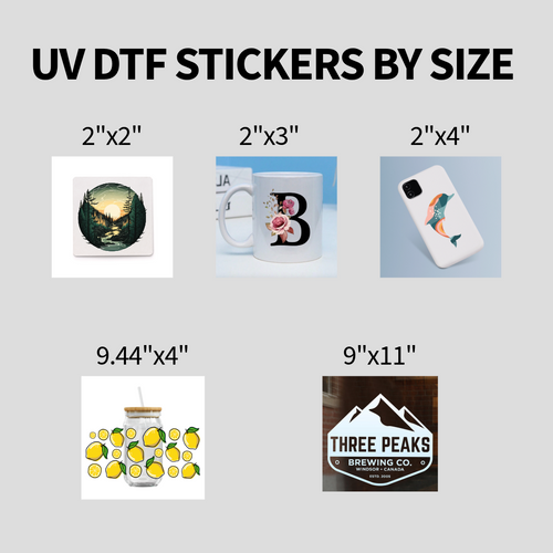
| One design at several sizes for youth, adult, coach, and fan shirts | Export one transparent file per size from the same master, so each file carries its own dimensions for the press operator. |
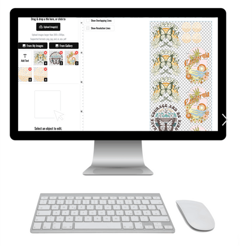
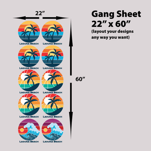
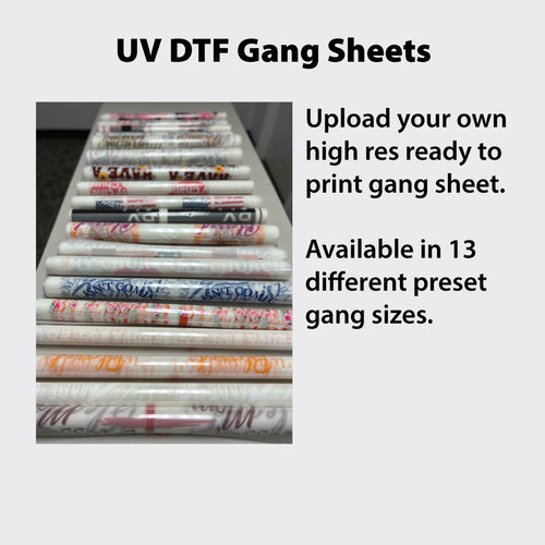
When an order holds two or more designs, the most cost-effective route is the online gang sheet builder: upload the finished transparent files, size them, set quantities, and click apply, and it arranges the pieces on the film. That beats nudging each graphic by hand and wastes less film, which is why we point people to DTF gang sheets once their files are clean. Use it after each file is transparent and correctly sized, not before.
One check before a repeated run. Owning an editable file is not the same as owning the art. Converting someone else's design into SVG or EPS doesn't make it yours, so confirm you made it, licensed it, or hold permission before you press it 200 times.
Lion DTF Transfers prints full-color DTF transfers for cotton, polyester, and blends, and takes the vector masters you've cleaned up straight to film. If you're stuck with a flat JPG or a logo pulled off a website, design vectorizing is $15 and a full logo or shirt design is $75. Email orders@liondtf.com and the team can remove a background in most cases without lowering resolution, or send the file through Lion DTF Transfers and get the export confirmed before anything goes on press.