


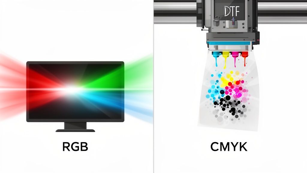
Here’s the deal: the core difference between CMYK and RGB is actually pretty simple. RGB is for screens, and CMYK is for print. Your phone, your laptop, your TV—they all use RGB (Red, Green, and Blue) light to mix colors that glow. It’s an additive process. DTF printers, on the other hand, use CMYK (Cyan, Magenta, Yellow, and Black) ink, which subtracts light as ink hits the film, creating a totally different range of colors.
Understanding Why Screen Colors Differ From Print Colors
It’s one of the most common frustrations in DTF printing. You create this incredible design with vibrant, electric colors on your screen, but when the final transfer arrives, it looks… flat. Disappointing. This isn't a mistake by the printer; it’s just the physics of how color works in two completely different worlds.
Your screen is literally emitting light. It combines red, green, and blue light at different brightness levels to produce a massive, brilliant spectrum of colors. Think of it like shining colored spotlights onto a dark stage—when you add them all together, you get pure white light. This is the additive color model.
Printing is the exact opposite. A DTF printer layers inks—cyan, magenta, yellow, and black—onto a transfer film. These inks absorb light waves, subtracting them from the white light that hits the surface. Instead of adding light to make colors, you’re adding ink to take light away. Mix them all, and you get black. This is the subtractive color model.
Digital Light vs Physical Ink
The nightmare scenario for any creator is getting a box of prints that look washed out compared to the files they uploaded. This happens because the RGB additive model can produce a staggering 16.7 million colors, many of which are simply too bright and luminous for ink on film to replicate.
The CMYK subtractive model has a much smaller color range, or gamut. In fact, many e-commerce print platforms report that over 70% of files uploaded by non-designers are in the default RGB format, which is a major source of production delays and rejected orders. You can find more detail on this in various detailed printing guides.
Understanding this core concept is key: you are not matching color, you are translating it from one "language" (light) to another (ink). Proper file setup isn't just a technicality—it's the only way to ensure your vision translates accurately to the final product.
Core Differences Between RGB and CMYK
To put it all in one place, here’s a quick breakdown of what separates these two essential color models.
| Characteristic | RGB (Digital Screens) | CMYK (Physical Prints) |
|---|---|---|
| Primary Colors | Red, Green, Blue | Cyan, Magenta, Yellow, Key (Black) |
| Color Model | Additive (adds light to create color) | Subtractive (subtracts light with ink) |
| Best For | Websites, apps, social media, digital photos | DTF transfers, business cards, merchandise, flyers |
| Black Creation | Absence of all light (0,0,0) | Combination of all inks (100% K) |
| White Creation | Full intensity of all light (255,255,255) | The absence of ink (the paper/film color) |
Ultimately, failing to design in the right color space from the start just leads to wasted materials and frustration. When you set up your files in CMYK from the beginning, you’re working in the same color language as the printer. This means predictable, professional results every single time. Tools like our Auto-build gang sheet builder are designed for CMYK-ready files, ensuring color consistency and cost-effectiveness across every design on your sheet.
When to Use RGB vs. When to Use CMYK
Knowing the technical difference between RGB and CMYK is a good start, but understanding exactly when and where to use each one is what truly sets the pros apart. These two color models are built for entirely different worlds, and using the wrong one is a surefire way to get disappointing results.
Think of it like this: you wouldn't use a hammer to turn a screw. Each tool has its job.
The World of RGB: For Screens and Digital Media
RGB is the native language of anything you see on a screen. Since monitors, phones, and TVs create color by emitting light, this additive color model is the universal standard for any design that will live in the digital realm. Its massive gamut allows it to produce millions of bright, luminous hues that pop on a glowing pixel display.
You see RGB in action every single day. It’s the backbone of the entire digital experience.
- Web and App Design: From the buttons you click to the backgrounds you scroll past, every element is designed in RGB to ensure colors are vibrant and consistent across different devices.
- Social Media Content: Those eye-catching Instagram posts, Facebook banners, and YouTube thumbnails? All created and viewed in RGB, taking full advantage of its wide range of colors to grab attention.
- Digital Photography: Your camera or smartphone captures light from a scene and saves it as an RGB file. All the editing you do in software like Adobe Photoshop also happens in this native digital color space.
The rule of thumb is simple: If your final design will never be a physical object—if it’s only meant to be viewed on a screen—your project should stay in RGB from start to finish.
CMYK: The Foundation of Physical Printing
On the flip side, CMYK is the non-negotiable standard for any project destined for the physical world. The subtractive process of layering inks is how color is reproduced on tangible surfaces, from business cards to billboards.
For creators and apparel brands, this is critical: CMYK is the required format for Direct-to-Film (DTF) transfers. To get accurate and predictable colors on your merch, your design files have to be prepared in CMYK. If you send an RGB file, the printer's software is forced to guess at the conversion, and that's a gamble you'll almost always lose. For more ideas on what's possible, check out our guide on creating amazing custom heat transfer designs.
Let's say your brand logo features a brilliant, electric blue that looks fantastic on your website (an RGB environment). If you try to print that same RGB file on a t-shirt, that vibrant blue will likely come out looking dull and almost purplish. The proper workflow is to thoughtfully convert the logo to a specific CMYK profile, which lets you adjust the color values to find the closest, richest match possible for ink on fabric.
This preparation ensures your brand stays consistent, from screen to apparel. It’s absolutely essential for getting predictable results and making the most of every inch of film, especially when using cost-effective tools like our Auto-build gang sheet builder.
How Color Gamut Affects Your DTF Transfer Quality
Knowing the difference between CMYK and RGB is only half the story. The real-world impact on your final DTF transfers boils down to a concept called color gamut—the specific range of colors a device can actually produce. It’s the single biggest reason a design that looks perfect on your screen can show up differently on a finished shirt.
Think of the RGB gamut as a massive box of crayons with every color imaginable, including fluorescent and neon shades that seem to glow. The CMYK gamut is a slightly smaller, more standard box. It still has a huge range of beautiful, rich colors, but it simply doesn't contain those ultra-bright, luminous options that only exist as light.
This isn’t a flaw in the printing process; it's just the physics of translating light into ink. Screens create color by emitting light, which allows for an incredibly vibrant and expansive gamut. DTF printers, on the other hand, use physical ink pigments, which have a naturally more constrained range of color.
Why Some Colors Shift More Than Others
You’ll notice this gamut difference most with colors that rely heavily on the brightness of a screen. These are the shades that are most challenging to reproduce with physical ink.
These "out-of-gamut" colors often include:
- Electric Greens and Limes: These colors get their signature "glow" from the green light diode in a pixel, an effect that cyan and yellow ink just can't replicate perfectly.
- Vibrant Oranges: The bright, fiery oranges you see on screen often become slightly more muted or reddish when converted to their closest CMYK equivalent.
- Deep, Rich Blues: Digital blues, especially intense shades like royal or cobalt blue, frequently shift toward purple during the CMYK conversion.
Anticipating these potential shifts is key to managing expectations and prepping your files for the best possible outcome. Knowing that your super-bright lime green will become a rich, but less electric, shade helps you design more effectively from the start.
This visual helps break down where each color model is best applied, highlighting the divide between digital screen use and physical print products.
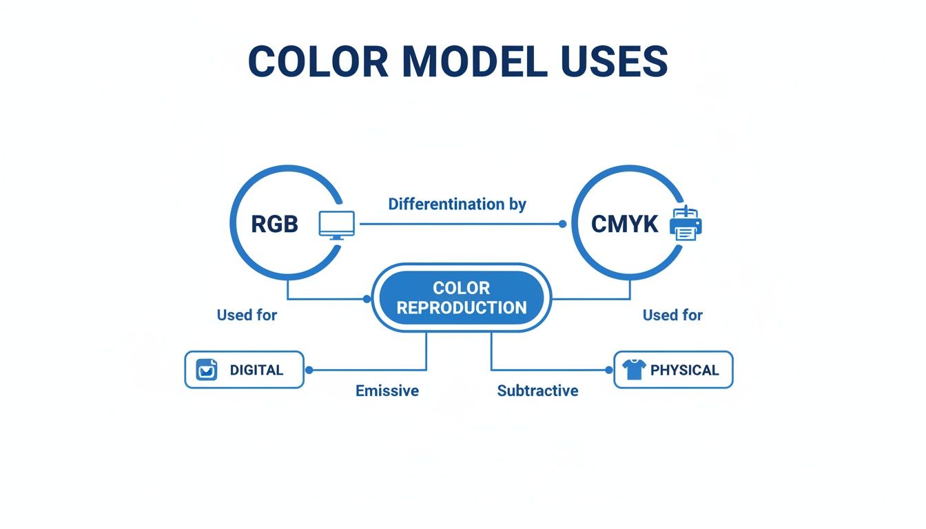
The key takeaway here is that RGB is built for digital interfaces like websites and social media, while CMYK is the established standard for physical products like DTF-printed apparel.
Bridging the Gamut Gap with Professional Tools
So, how do you get the best possible print from an RGB file that contains out-of-gamut colors? This is where a professional print provider makes all the difference. At Lion DTF, we don’t just hit "print" on your file; we run it through an optimization process using advanced tools designed to bridge that gap between color spaces.
We use sophisticated RIP (Raster Image Processor) software that’s loaded with custom ICC profiles. An ICC profile is essentially a data file that maps out how a specific device—in this case, our printers—reproduces color. It acts as a translator, intelligently converting your design's colors to the closest possible matches within our printer's CMYK gamut.
This intelligent conversion is far more accurate than a standard, automated color mode change you might perform in a design program. Our system analyzes every color in your RGB file and finds the best CMYK match, preserving as much vibrancy and detail as the medium physically allows. This ensures your final DTF transfer is brilliant, accurate, and as close to your original vision as possible.
This color management workflow is especially critical when you're printing multiple designs at once. By preparing all your files with a consistent CMYK approach, you guarantee color uniformity across every single item. It’s why our Auto-build gang sheet builder is so effective; it allows you to arrange multiple CMYK-optimized designs on one sheet, ensuring consistent color and maximum cost-effectiveness for your entire run. This kind of smart prep work minimizes surprises and elevates the quality of your finished products.
A Step-By-Step Guide to Preparing Print-Ready Files
Knowing the difference between CMYK and RGB is one thing, but actually putting that knowledge to work is what separates a decent print from a great one. A print-ready file is your best defense against unexpected color shifts and disappointing results. This guide walks you through a clear, practical workflow to get your designs set up correctly from the start.
Following these steps means the file you send us is a true representation of your vision. It’s all about taking control of the process instead of leaving your colors up to chance.
Starting Your Project the Right Way
The most reliable way to guarantee color accuracy is to begin your project in the right color space from the get-go. When you start in CMYK, you’re designing within the printer’s color gamut from the very first click, which helps you avoid a risky conversion down the road.
Before you even get to color conversions, many designers use tools like free AI image generators to create the initial concepts. Once you have that base design, setting it up correctly in your software is the next mission-critical step.
Here’s how to create a new CMYK document in the tools you’re already using:
- Adobe Illustrator: Go to File > New. In the "New Document" window, find the Advanced Options dropdown and choose CMYK from the "Color Mode" list.
- Adobe Photoshop: Head to File > New. In the dialog box, you'll see a "Color Mode" option. Just select CMYK Color from that dropdown before you hit "Create."
By taking this simple first step, you’re already working with a palette that our DTF printers can reproduce accurately.
Converting Existing RGB Designs to CMYK
What if your masterpiece is already finished and sitting in an RGB file? Don't sweat it—you can still convert it. This process just requires a bit more care to manage the color shifts that are bound to happen. Simply changing the mode isn't enough; you need to assign the right profile and preview the results to do it properly.
Think of it less like a menu click and more like a thoughtful translation from one color language to another.
- Open Your RGB File: Get your design opened up in Adobe Photoshop or Illustrator.
- Assign the Correct Profile: Before you do anything else, go to Edit > Convert to Profile. This gives you way more control than just changing the mode.
- Choose a Destination Space: In the "Destination Space" dropdown, pick a standard CMYK profile. A solid, safe choice for DTF printing in North America is U.S. Web Coated (SWOP) v2. This tells the software exactly how to translate the RGB values into their closest CMYK equivalents based on standard print conditions.
- Review and Save: After the conversion, save a new version of your file. Never, ever overwrite your original RGB file. You’ll probably need it for digital use later.
Key Insight: Using the
Convert to Profilecommand is far better than just going toImage > Mode > CMYK Color. It uses a specific rendering intent to map colors more intelligently, giving you a much cleaner and more predictable conversion.
The Power of Soft Proofing
The single most valuable tool you have for preventing print-day surprises is soft proofing. This feature, built into Photoshop and Illustrator, simulates how your design's colors will actually look when printed with a specific CMYK profile. It's like getting a digital sneak peek of the final physical print, right on your screen.
Soft proofing shows you which of your vibrant screen colors are "out-of-gamut" and will shift during printing. This lets you make adjustments before the file ever gets to the printer, saving you time, money, and a whole lot of frustration. For a deeper look, our guide on the RGB to CMYK conversion process has more tips and visuals.
Here’s a quick workflow for soft proofing:
- Enable Proof Colors: In Photoshop or Illustrator, navigate to View > Proof Setup > Custom. Select the exact same profile you used for the conversion (e.g., U.S. Web Coated SWOP v2).
- Toggle the Preview: Now, you can flip the preview on and off by going to View > Proof Colors (or using the shortcut Ctrl+Y/Cmd+Y). This allows you to instantly compare your original RGB colors to the simulated print output.
- Make Adjustments: With the proof turned on, you can fine-tune any colors that look dull or have shifted. Use adjustment layers like Hue/Saturation or Selective Color to nudge those tones back toward your original intent.
Once you master these prep steps, you can be confident that every file you create is perfectly optimized for DTF printing. This attention to detail is what defines a professional-quality transfer. And when your files are ready, our Auto-build gang sheet builder simplifies the next part of the process, letting you arrange multiple print-ready designs for maximum efficiency and cost effectiveness.
Solving Common Color Shift Issues in DTF Printing
Even when you do everything right with your file prep, it’s still possible to face frustrating color shifts when your design goes from screen to transfer. This isn't a mistake on your part; it's just the reality of translating a design from the vast, light-based world of RGB to the more constrained, ink-based world of CMYK.
Knowing how to troubleshoot these common hiccups is what separates the pros from the beginners. It’s all about anticipating the quirks of the color conversion process and making a few smart adjustments before you ever hit "print."
Why Your Black Prints Gray
One of the most common surprises is designing a deep, solid black (RGB 0,0,0) on your screen, only to see it print as a flat, washed-out gray. This happens because a straight conversion turns that pure digital black into a CMYK formula of C:0, M:0, Y:0, K:100. In the physical world, using only black ink simply isn't enough to create a truly deep, saturated black.
The solution is to build a rich black by adding other inks to support the black. This creates a much deeper tone that absorbs more light and looks like the true black you intended.
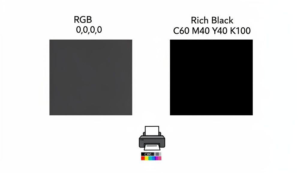
A reliable rich black formula for DTF printing is C:60, M:40, Y:40, K:100. This blend uses cyan, magenta, and yellow to bolster the black ink, giving you that professional, deep finish you were aiming for.
When Bright Blue Turns Purple
Another classic color shift involves vibrant blues. You pick an electric royal blue in RGB, but the final transfer has a disappointing purple tint. This is a gamut issue—many bright digital blues simply don't exist in the CMYK color space.
When the printer's software tries to replicate that brilliant blue, it often overcompensates with magenta ink, pulling the color toward purple. To fully grasp this and correct it, it helps to understand the fundamentals of CMYK conversion to RGB and why manual tweaks are necessary.
To fix this purple shift, you need to manually adjust your CMYK values:
- Reduce Magenta: This is the most important step. Dial back the magenta value in your color picker.
- Increase Cyan: At the same time, give the cyan value a slight boost to keep it blue.
There's no single magic number here, as the right formula depends on your specific shade of blue. A great rule of thumb is to make sure your magenta value is at least 25-30% lower than your cyan value. Soft proofing is your best friend here—it lets you see the shift on screen so you can make precise adjustments until that purple tint is gone.
A perfect, one-to-one match between a glowing monitor and physical ink is almost impossible. The real goal is smart preparation. By anticipating these common shifts and using targeted CMYK formulas, you can get incredibly close and dramatically improve the quality of your final transfers.
This kind of proactive troubleshooting puts you in complete control. For an even more detailed look at color expectations and specific swatches, the Lion DTF Color Matching Guide offers much deeper insights.
When you master these simple corrections, every design you create is truly print-ready. Tools like our Auto-build gang sheet builder become even more powerful, allowing you to place multiple corrected designs on one sheet with full confidence that every single one will print consistently and accurately.
Putting It All Together with Smart DTF Tools
Getting a handle on the CMYK vs. RGB divide—designing in the right space, soft-proofing your work, and using the correct profiles—is what separates amateurs from pros in DTF printing. This knowledge turns your workflow from a guessing game into a reliable, repeatable system. But theory only takes you so far. To really put these lessons to work, especially on bigger orders, you need tools built for production.
At Lion DTF, we connect the dots between perfect file prep and a smooth, affordable print run. Our whole online platform is designed to support creators who get why color accuracy matters, and we offer real-world solutions that get rid of common holdups.
Maximize Your Efficiency and Consistency
Once you’ve got your CMYK designs dialed in, the next challenge is to print them in a way that’s fast and cost-effective. This is where smart workflow tools become essential. Instead of printing each design one at a time, grouping them onto a single sheet is a game-changer for saving time and materials.
Our Auto-build gang sheet builder was engineered for exactly this. It’s a straightforward tool that lets you upload and arrange multiple CMYK-optimized designs on one sheet without any fuss. The benefits here are twofold:
- Guaranteed Color Consistency: When you place all your properly profiled designs onto one sheet, you’re making sure they all get printed in the same run under identical conditions. This all but eliminates color shifts between individual transfers in a batch.
- Ultimate Cost-Effectiveness: The builder helps you intelligently pack your artwork together, using every possible inch of the transfer film. This cuts down material waste, which directly lowers your cost per print and boosts your profit margins on every single order.
By combining your print-ready files with a tool like our gang sheet builder, you create a powerful and efficient workflow. You get the color accuracy of a solid CMYK process plus the economic benefit of maximized material usage.
Expert Support for Any Workflow
Look, we get it. Not everyone has the time or the desire to fine-tune every single layout. For creators who’d rather be hands-off but still need perfect results, we offer our 'We Build a Gang Sheet for You' service. Just upload your individual CMYK files, and our in-house team will take care of the layout, making sure everything is placed for optimal print quality and efficiency.
Ultimately, we want to be your go-to production partner. By matching our commitment to color accuracy, fast turnarounds, and real support with powerful online tools, we make professional-grade DTF printing something anyone can access. Whether you build the sheet yourself or let us handle it, we’ll make sure your vision is printed correctly and efficiently, every time.
Frequently Asked Questions
When you're getting files ready for a professional DTF print run, a few common questions always pop up around CMYK and RGB. Getting the answers straight from the start is the best way to sidestep common mistakes and make sure your transfers turn out exactly how you envisioned them.
Can I Just Send My RGB File and Let You Convert It?
While we can convert your RGB files for you, we really recommend you don't go that route. Automated conversions are blind to your creative intent and often lead to frustrating color shifts—like a vibrant, electric blue on your screen turning into a dull, muddy purple on the final print.
When you handle the conversion to CMYK yourself, you're in the driver's seat. You can use your software's soft proofing tools to get an accurate preview of the final output, letting you tweak colors and get the final DTF transfer looking just right.
What Happens If I Use a Black from an RGB File?
A standard RGB black (R:0, G:0, B:0) almost always converts to a CMYK value of 100% K (black ink) and nothing else. On film, this doesn't create a true, deep black; it often looks more like a flat, washed-out dark gray.
To get that deep, saturated black that makes designs pop, you need to define a rich black in your CMYK file. A solid formula like C:60, M:40, Y:40, K:100 blends all four inks to produce a much darker, more professional result on your transfers.
Why Is a CMYK Workflow Better for Gang Sheets?
Keeping everything in a consistent CMYK workflow is absolutely essential for color uniformity across a gang sheet. If you start mixing RGB and CMYK files on the same sheet, each one gets converted with a generic profile, leading to obvious and disappointing color differences between designs that are supposed to match.
By prepping all your artwork in the correct CMYK color space from the beginning, you guarantee that what you see in your final proof is exactly what you get on the film. It makes tools like our Auto-build gang sheet builder incredibly reliable, giving you cost-effective results with consistent quality across the entire batch.
Is It Possible to Perfectly Match a Pantone Color?
This is a tricky one. Pantone colors are mixed from specific spot inks, like mixing a can of paint to get an exact shade. DTF printing, on the other hand, simulates colors by layering tiny dots of cyan, magenta, yellow, and black ink. Because the methods are fundamentally different, a perfect 1:1 match just isn't always physically possible.
We can get remarkably close to most Pantone shades, but some colors will always have slight variations. For brand-critical work, the best approach is to use Pantone's official CMYK bridge values as a starting point. From there, use soft proofing to see the closest possible match our printers can achieve.
At Lion DTF Transfers, our goal is to make professional printing feel straightforward and accessible. With the right tools and expert support, you can navigate the CMYK vs. RGB workflow with total confidence. Start your next project with us today at https://liondtf.com.