


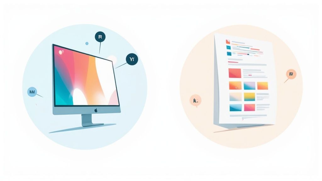
Ever stare at a print that looks dull and lifeless compared to the vibrant design you created on screen? It’s a classic, frustrating problem, but it’s not your fault—it’s just a matter of two different color languages at play.
Your screen speaks RGB (Red, Green, Blue), while printers speak CMYK (Cyan, Magenta, Yellow, Key/Black). The trick is getting them to translate correctly.
Why Your Screen Colors Don't Match Your Prints
The gap between what you see on a glowing monitor and what you hold in your hand is all about how colors are made. It's a fundamental difference between light and ink.
Digital screens create color by starting with a black canvas and adding light. Mixing red, green, and blue light produces a massive spectrum of brilliant, luminous colors. This is an additive process, perfect for websites, digital ads, and anything viewed on a screen.
Printers do the opposite. They start with a white surface (like paper or transfer film) and subtract brightness by adding layers of ink. As cyan, magenta, and yellow mix, they absorb light and get darker. This subtractive process uses Black (Key) ink for true blacks and deep shadows that mixed inks just can't nail on their own.
To make it simple, here’s a quick breakdown of how these two color models stack up against each other.
RGB vs CMYK At a Glance
| Attribute | RGB (Red, Green, Blue) | CMYK (Cyan, Magenta, Yellow, Key/Black) |
|---|---|---|
| Primary Use | Digital Screens (monitors, phones) | Print Media (shirts, flyers, posters) |
| Color Method | Additive (adds light to create colors) | Subtractive (subtracts light with ink) |
| Color Gamut | Larger, more vibrant spectrum | Smaller, more limited spectrum |
| File Formats | JPEG, PNG, GIF | PDF, AI, EPS, TIFF |
| Best For | Websites, social media, video | T-shirts, business cards, photos |
Understanding this table is the first step to avoiding mismatched colors and getting predictable, professional results every time you print.
The Real-World Impact of Mismatched Colors
This isn't just a technical detail—it has real consequences. If you’re creating assets for print, like professional restaurant menu photos, getting the color conversion wrong can lead to costly reprints, blown deadlines, and a brand that looks inconsistent.
The problem is surprisingly common. Print shops in major markets often reject 15-25% of files submitted in RGB each year, leading to billions in rework costs. Even with today's advanced software, an automated RGB to CMYK conversion can shift colors by an average of 15% in Delta E—a difference easily noticeable to the human eye.
Key Takeaway: Always design with the end product in mind. If your art is going on a t-shirt, banner, or sticker, start your project in CMYK mode from the get-go. It's the simplest way to guarantee what you see is what you get.
How This Affects Your DTF Transfers
For Direct-to-Film (DTF) printing, where color vibrancy is everything, proper file prep is non-negotiable. Sending an RGB file to a DTF printer forces its software to make a guess during conversion, and that guess is often wrong.
This can lead to some major headaches:
- Dull or Muted Colors: Those super-bright blues, greens, and pinks that pop on screen often don't exist in the CMYK gamut and will look flat in print.
- Inconsistent Branding: Your brand's specific shade of red might print as a dull orange, completely undermining your brand recognition.
- Unexpected Color Shifts: A simple, cool gray can suddenly turn into a muddy brown, ruining the entire design.
To dodge these issues and make sure your DTF transfers are as brilliant as you designed them, you have to nail the RGB to CMYK conversion. Getting this right ensures your colors stay consistent across every single order. Once your files are ready, our Auto-build gang sheet builder simplifies the printing process, making it easy and cost-effective to get your designs onto transfer sheets.
Why Your Colors Look Dull in Print (And How to Fix It)
Ever designed something with a stunning electric blue on screen, only to get a sad, muted navy on the final print? You're not alone. The reason this happens boils down to one core concept: color gamut.
Think of it like this: your monitor and a printer speak two different languages. Your screen uses the RGB (Red, Green, Blue) color model, which is based on light. It has a massive vocabulary, capable of creating millions of bright, luminous colors. A printer, on the other hand, uses the CMYK (Cyan, Magenta, Yellow, Black) model, which is based on ink. Its vocabulary is much smaller and more practical.
This creates a "gamut mismatch." Your screen can show off vibrant colors that simply don't have a direct translation in the world of ink. When you send an "out-of-gamut" color to the printer, it does its best to find the closest match, but the result is almost always a duller, less vibrant version of what you saw on your display.
The Usual Suspects: Which Colors Suffer the Most?
Not all colors get hit equally hard. The most disappointing shifts happen with the super-saturated, bright colors that rely on light to really pop.
Keep an eye on these common culprits:
- Vibrant Blues & Purples: That brilliant royal blue often turns into a much darker, almost purplish navy.
- Neon & Lime Greens: Electric greens lose their glow and end up looking more like an earthy, olive tone.
- Bright Oranges & Reds: The fiery orange you designed can come out looking flat, sometimes leaning toward a muddy brown or a dull red.
This isn't just a minor headache; it's a massive issue with real financial consequences. While an RGB display can show over 16.7 million colors, a standard CMYK process can only reproduce about 70-80% of them. In the massive $340 billion commercial printing industry, printers in the U.S. report that 22% of all client revisions are due to these color surprises. That adds up to an estimated $1.2 billion wasted annually on reprints and delays. For more on how these conversions impact quality, check out this great resource.
Don't Just Convert—Preview and Adjust
Blindly hitting "Convert to CMYK" and hoping for the best is a recipe for disaster. The professional approach is to identify which colors are going to cause problems before you convert. This is where a powerful tool in software like Adobe Photoshop called the Gamut Warning comes in.
When you turn it on, Photoshop overlays a flat gray mask on any part of your image that contains colors outside the target CMYK gamut. This gives you a clear visual map of the problem areas.
Here's what it looks like in action. The grayed-out parts of the flower are the colors that will shift dramatically in print.
Seeing this preview allows you to go in and manually adjust the saturation or hue of those specific areas. You can gently pull them back into the printable CMYK range yourself, giving you far more control over the final look than a simple automated conversion ever could.
Pro Tip: Never just convert the whole file and cross your fingers. Use soft proofing and the gamut warning to make targeted, intentional edits. This simple step preserves your creative vision and saves you from the cost and frustration of reprinting an entire job.
This proactive mindset is the key to getting predictable, consistent results. And when you're dealing with lots of designs, efficiency is everything. That’s why we built our Auto-build gang sheet builder. It lets you upload multiple print-ready CMYK files and automatically arranges them for you, making the entire workflow faster and more cost-effective. It ensures the colors you so carefully managed translate perfectly to your final DTF transfers.
A Practical Conversion Workflow for Adobe and Affinity
Theory is one thing, but getting a print project right comes down to having a reliable, hands-on process. Moving your designs from the super-vibrant world of an RGB screen to the ink-based reality of CMYK takes more than a single click. It's about a methodical workflow that gives you control, ensuring your prints look intentional, not like a happy (or unhappy) accident. Whether you're a seasoned pro in Adobe Creative Cloud or a rising star using Affinity tools, the core principles of a solid RGB to CMYK conversion are the same.
This visual flow shows the core challenge here: gamut mismatch. It's the process of squeezing all those bright, beautiful RGB screen colors into the smaller, printable CMYK color space.

The key takeaway is that this mismatch is unavoidable. The pros just know how to anticipate it with a proper workflow, and that's what separates professional results from disappointing prints.
Setting the Stage in Adobe Photoshop
Photoshop is the industry workhorse for a reason—it gives you incredible control over color management. The very first step isn't to convert anything, but to set up your environment for success.
Start by opening your Color Settings (found under the Edit menu). Think of this dialog box as your mission control for color consistency. For most print work in North America, a safe and widely accepted choice for the CMYK working space is U.S. Web Coated (SWOP) v2. This ICC profile essentially tells Photoshop how a standard commercial printing press reproduces color, and it becomes the foundation for all your previews and conversions.
Once your settings are dialed in, the real work begins with a non-destructive preview.
The Power of Soft Proofing Before You Commit
The single most powerful tool in your conversion toolkit is Soft Proofing. Instead of immediately changing your file's color mode, it simulates how your RGB image will look when printed using the CMYK profile you just selected.
To turn it on, go to View > Proof Setup > Custom. Here, you can select your CMYK profile (like SWOP v2) and, most importantly, turn on the Gamut Warning. This instantly highlights all the out-of-gamut colors—the ones that will shift—showing you exactly where the problem spots are.
With the soft proof active, you can now make targeted adjustments to these specific areas using tools like Hue/Saturation or Selective Color. You are essentially pulling those unruly RGB colors back into the printable CMYK range manually. This preserves the spirit of your design rather than letting an algorithm make a blind guess for you.
This proactive adjustment is the difference-maker. By editing in RGB mode while viewing a CMYK preview, you maintain maximum color information and only commit to the conversion as the very last step.
After you've made your tweaks, you can perform the final conversion using Edit > Convert to Profile. Since you’ve already done the heavy lifting, this final step should result in a file that closely matches the soft proof you were just working with.
A Streamlined Approach in Adobe Illustrator
For vector work in Illustrator, the process is a bit different but follows the same core logic. You can change your document's color mode at any time via File > Document Color Mode > CMYK Color. This simple switch was a huge leap forward back in the day. While desktop publishing in the 1980s saw RGB dominating 70% of workflows, the introduction of the Adobe ICC standard in 1997 slashed conversion errors by 60%, enabling consistent results across 80% of professional software. Today, this simple mode switch is used in an estimated 88% of vector workflows to prepare print-ready files.
Just like in Photoshop, you can enable a soft proof by going to View > Proof Setup. This lets you preview how your vibrant RGB vectors will translate to CMYK ink before you commit. When you're ready to export, saving as a PDF/X-1a:2001 is a bulletproof method. This format automatically converts all colors to the designated CMYK profile and flattens transparency, creating a file that's ready for nearly any professional printer.
Conversion Tips for Affinity and GIMP Users
You don't need an Adobe subscription to get professional results. Affinity Designer and Photo have become powerful, affordable alternatives with surprisingly robust color management.
-
Affinity Designer/Photo: The workflow is strikingly similar to Adobe's. You can set your document's color format to a CMYK profile right when you create it. To soft proof, just go to
View > Soft Proofand select the right ICC profile. This gives you a live preview of the final print, so you can make adjustments before exporting. -
GIMP: While historically focused on RGB, modern versions of GIMP have improved their CMYK support. It does require a little more setup, often involving a plugin like
Cyanto handle CMYK separations properly, but it's definitely achievable.
No matter your software, the strategy is always the same: preview, adjust, then convert. As you get more comfortable, exploring specific strategies for designing for Print On Demand can help you refine your process even further.
Once your designs are perfectly converted, getting them printed should be just as seamless. For creators working on custom apparel, efficiency is everything. That’s where tools like our Auto-build gang sheet builder come in handy. You can upload multiple print-ready CMYK designs, and it automatically arranges them to maximize every inch of the transfer film. This not only simplifies your workflow but also cuts down on material waste, making your production runs more affordable. For more ideas, check out our guide on how to create custom heat transfer designs.
Optimizing Your Colors for DTF Printing
Direct-to-Film (DTF) printing is known for creating some seriously vibrant and tough designs. But here’s the thing: getting that eye-popping color isn't magic. It all comes down to smart file preparation. Even though DTF has a wider color range than other print methods, it's still grounded in the world of CMYK. If you want to unlock the full power of this technology, you've got to prep your files the right way.
Moving from a digital RGB file to a killer DTF print is more than just clicking "Convert to CMYK." It’s about being proactive. You have to anticipate how your on-screen colors will translate to ink on film and make adjustments to keep the punch and depth of your original vision.
This means we need to get into the details—like building a truly deep black and making sure your brightest colors don’t get lost in translation.
Building a Better Black for DTF
One of the most common mistakes I see in print design is with the color black. On your screen, an RGB value of (0, 0, 0) looks perfectly black. But in the CMYK world, just using 100% Black (K) ink often comes out looking like a dull, washed-out gray, especially on bigger solid areas. This is where "rich black" saves the day.
Rich black is just a custom CMYK mix that beefs up the black ink with other colors, creating a much deeper, more saturated tone. For DTF, a solid rich black formula is non-negotiable if you want that bold, professional look.
A great starting recipe for a rich black in DTF is:
- Cyan: 60%
- Magenta: 40%
- Yellow: 40%
- Black (K): 100%
This specific combo gives you a deep, neutral black that looks solid and opaque without dumping too much ink onto the film. Try to keep your total ink coverage below 240-260%, otherwise you risk the ink bleeding or taking forever to dry.
Counteracting Color Dulling Proactively
Like we've talked about, the jump from the wide-open world of RGB to the more limited CMYK gamut can flatten your most vibrant colors. Since brightness is a huge selling point for DTF, you have to be strategic to compensate for this shift.
Don't just let your software take a wild guess. Take control and manually boost certain colors before you convert. If you’ve got a bright royal blue that you know is going to dull down, jump into Photoshop and use a Hue/Saturation adjustment layer to bump up its saturation just a bit. This gives the printer a richer color to work with, meaning the final print will be much closer to what you had in mind.
Key Insight: The goal isn't to perfectly match the on-screen RGB color—that's impossible. The real goal is to create a CMYK equivalent that preserves the visual impact of the original. It's a subtle difference, but it's everything.
This same thinking applies to other tricky colors like neons and bright oranges. You can even look into how Pantone Matching System (PMS) colors translate to CMYK to get more predictable results. If you want to dive deeper, check out our guide on achieving specific shades like gold using PMS colors in your designs.
Streamlining Your Workflow with Gang Sheets
Getting one CMYK file ready for print is simple enough, but when you're scaling up production, you need to be efficient. For small businesses and print shops, using every inch of material is key to keeping costs down. That's why arranging multiple designs onto a single sheet of transfer film—creating a "gang sheet"—is the industry standard.
But manually arranging dozens of designs is a massive headache. It's tedious, easy to mess up, and almost always leaves wasted space. This is exactly why we built our Auto-build gang sheet builder. This tool completely changes the game.
Just upload all your perfectly optimized, print-ready CMYK files, and the software automatically nests them in the most efficient layout possible. It’s smart enough to fit different shapes and sizes together to maximize every square inch of the film. This not only makes sure your carefully managed colors print perfectly but also makes your entire process way more cost-effective. For anyone doing high-volume DTF, it’s a lifesaver.
Common Conversion Mistakes and How to Fix Them
Converting your artwork from the glowing world of RGB screens to the ink-on-paper reality of CMYK is a make-or-break moment for any print project. It’s also a process loaded with little traps that can catch even seasoned designers off guard. One small oversight can leave you with muddy colors, blurry text, or a final print that looks nothing like what you designed.
The good news? Nearly all of these issues are completely avoidable once you know what to watch out for.
It all comes down to building good habits and running through a reliable pre-print checklist. By sidestepping these classic blunders, you can ensure your DTF transfers come out sharp, vibrant, and professional every single time.
Forgetting to Embed Your Color Profile
This is one of the most common—and invisible—mistakes out there. When you save a file without embedding its ICC color profile, you're essentially sending it to the printer without instructions. You’re leaving them to guess which specific "dialect" of CMYK you intended. Was that a U.S. Web Coated (SWOP) v2 or something else entirely?
That guesswork leads to major color shifts. The perfect navy blue you picked on-screen can easily print as a dull, lifeless purple because the printer's default profile interpreted your color values differently.
The Fix: This one’s easy. Just make sure you always check the "Embed Color Profile" box in your software’s "Save As" or "Export" dialog. This simple click packages the color recipe right into the file, telling the printer exactly how to mix your colors with precision.
The Rich Black vs. Plain Black Problem
On your screen, black is black. Simple. But in the world of print, there are two very different types of black, and mixing them up is a classic rookie mistake.
Using only 100% K (Black) ink results in what’s known as "plain black." On paper, this often looks more like a washed-out charcoal gray, especially over large, solid areas. It just doesn't have the depth you're looking for.
To get that deep, saturated, truly opaque black, you need to use "rich black." This is a custom CMYK formula that supports the black ink with other colors, creating a much deeper, more substantial tone.
What to Do Instead: For bold, solid blacks in DTF printing, build a rich black using a formula like C:60%, M:40%, Y:40%, K:100%. This mix creates a deep, neutral black without oversaturating the film, giving you that crisp, professional finish you want.
Rasterizing Text and Vector Logos
Another frequent misstep is flattening vector elements like logos and text too early in the process. When you rasterize these elements at a low resolution before converting, you're trading clean, sharp edges for a blocky, pixelated mess.
This mistake turns crisp lines into jagged artifacts and makes small text nearly impossible to read. Vector artwork is designed to be infinitely scalable for a reason—it should always stay in its native format for as long as possible to maintain that sharpness.
The Fix:
- In Illustrator: Keep all your text and logos as live vector paths. When you're ready to export, save your file to a print-ready format like PDF/X-1a, which is designed to preserve all that crucial vector information.
- In Photoshop: Don't flatten your file! Keep your text and vector shape layers intact. If you must rasterize, wait until the final export and make sure your document resolution is set to at least 300 DPI.
Ignoring the Final Proofing Stage
After pouring hours into a design, the temptation to just hit "export" and send it off is real. But skipping that final, thorough proofing session is a recipe for disaster. This is your last chance to catch typos, double-check color values, and confirm all your settings are correct.
Once a file is sent to print, making changes is often costly and always time-consuming. A few extra minutes of review can save you from having to reprint an entire batch of transfers.
And when you're managing multiple jobs, this becomes even more critical. Our Auto-build gang sheet builder is designed to streamline production by arranging your files efficiently, but it can only work with what you give it. Ensuring each design is flawless before you upload makes the whole process faster and more cost-effective.
Before you hit that final "send" button, it pays to have a quick checklist. Running through these key points can help you catch common errors before they become expensive problems.
Pre-Print Checklist for Perfect CMYK Files
| Check | Action Required | Why It Matters |
|---|---|---|
| Color Mode | Confirm the file is in CMYK, not RGB. | Prevents unexpected and dramatic color shifts during printing. |
| Resolution | Ensure all raster images are at least 300 DPI. | Guarantees sharp, clear prints instead of pixelated or blurry results. |
| Rich Black Values | Verify solid black areas use a rich black formula (e.g., 60/40/40/100). | Avoids washed-out, grayish blacks and achieves a deep, solid tone. |
| Embedded Profile | Check that the correct ICC profile is embedded in the file upon saving. | Tells the printer exactly how to interpret your color data accurately. |
| Vector Integrity | Make sure text and logos are still vectors, not rasterized images. | Preserves crisp edges and scalability for professional-quality output. |
| Transparency | Flatten any complex transparencies that could cause printing errors. | Some printers struggle with live transparency, leading to unpredictable results. |
| Final Proofread | Read all text one last time to catch any typos or grammatical errors. | Catches mistakes that software can't, saving you from an embarrassing reprint. |
Taking a moment to run through this list is one of the smartest things you can do. It's the final quality gate between your design and a perfect print, ensuring your vision is translated flawlessly every time.
A Few Common Questions About RGB to CMYK
Switching from screen to print can feel like a minefield, especially when color is everything. Getting your artwork from RGB to CMYK correctly is the key to a professional, vibrant final product. Here are a few of the most common questions we get and the straight answers you need.
Can I Just Use an Online Converter Tool?
It’s tempting, I get it. Those free online tools seem like a quick fix. But honestly, they often create more problems than they solve.
Think of it this way: those tools perform a blind conversion. They have no idea what you’re printing on, what a DTF ink set can actually produce, or what your original design was meant to look like. You lose all control over critical elements like ICC profiles and have no way to preview the changes. The result? Unpredictable, often muddy colors that can ruin a whole batch of prints. For any professional job, stick with design software like Adobe Photoshop or Affinity Photo where you can steer the conversion with precision.
Why Do My Colors Look So Different After Converting?
This is the big one. The shift in color happens because RGB (light-based) and CMYK (ink-based) have completely different "gamuts"—the total range of colors they can produce. RGB's gamut is massive, full of bright, glowing colors that simply can't be mixed with ink.
When you convert to CMYK, your software has to find the closest possible match for any colors that fall outside the printable range. This is why those super-saturated electric blues, neon greens, and hot pinks tend to look duller or darker after conversion. It’s not a mistake; it's a limitation of physics. Using a controlled workflow with soft proofing lets you see these shifts before you commit, giving you a chance to make adjustments and keep the spirit of your design alive.
What's the Best File Format for CMYK Print Files?
Sending the right file type to your printer is a simple step that prevents a lot of headaches. While a format like JPEG might seem fine, its lossy compression can degrade your image quality every time you save it. Not ideal.
For the best and most reliable results, stick to one of these:
- PDF: This is the undisputed champion for print. A well-saved PDF locks everything in place—vectors, high-res images, fonts, and most importantly, your embedded CMYK color profile. It's a self-contained instruction manual for the printer.
- TIFF: An excellent choice for high-resolution raster images (like photos or complex Photoshop designs). It uses lossless compression, so you don't lose a single pixel of quality.
- AI or EPS: If your design is purely vector-based from Adobe Illustrator, these formats are perfect. They keep everything scalable and sharp, no matter the size.
Pro Tip: When in doubt, just ask your print provider what format they prefer. A quick email can save you from a costly reprint.
Ready to see your perfectly converted artwork come to life? Lion DTF Transfers makes it easy to get professional, vibrant prints without the guesswork. Once your files are print-ready in CMYK, just upload them to our Auto-build gang sheet builder to get the most out of every inch of film.