


So, you need a "PMS color for gold." What you're really asking for is a universal recipe, a way to make sure the gold in your head is the same gold that comes out of the printer. It’s a common frustration: a beautiful, shimmering gold on your monitor turns into a flat, muddy brown on the final product.
That's where the Pantone Matching System (PMS) comes in. It’s the industry’s solution to color consistency, providing specific codes for thousands of shades. With a PMS code, a designer in one city and a printer in another are quite literally on the same page.
Decoding the PMS Color System for Gold
Think of the Pantone system as the world's most trusted cookbook for color. Instead of recipes for food, it gives printers exact ink formulas to mix any specific shade. This is how a brand’s signature gold on a business card in New York can be identical to the gold on a t-shirt printed right here in Los Angeles.
This need for consistency is exactly why Pantone was created back in the early 1960s. Before then, color reproduction was a frustrating guessing game for designers and manufacturers. Lawrence Herbert, Pantone's founder, saw this chaos and developed a standardized guide that completely changed the game for everyone from cosmetics brands to graphic designers.
To get the gold you want, you first need to understand the two fundamental ways color is produced in professional printing.
Spot Color vs. Process Color
The difference between spot color and process color is everything when it comes to gold. This isn't just technical jargon; it's the key to getting the look you're after.
- PMS Spot Color: This is the real deal for metallics. A spot color is a special, pre-mixed ink. For gold, this ink actually contains tiny metallic particles that catch and reflect light, creating a genuine shimmer. It’s printed as a single, solid layer.
- Process Color (CMYK): This is a simulation. By mixing tiny dots of Cyan, Magenta, Yellow, and Black (CMYK), printers can create millions of colors. It can produce a yellowish-brown hue that suggests gold, but it will never have the reflective pop of a true metallic spot ink.
Key Takeaway: A true "PMS color for gold" usually means a metallic spot ink. This can't be perfectly replicated with standard CMYK printing. The goal is to find the right simulation or use a specialty transfer that gets you as close as possible to that authentic metallic look.
Getting this right is absolutely crucial for DTF printing. We help you bridge that gap by offering incredibly precise color simulations. You can see exactly how we handle different shades in our detailed DTF color matching guide.
Even better, our Auto-build gang sheet builder makes it super easy and cost-effective to test several gold shades on a single sheet. This way, you can find the perfect match for your project without having to commit to a big order first.
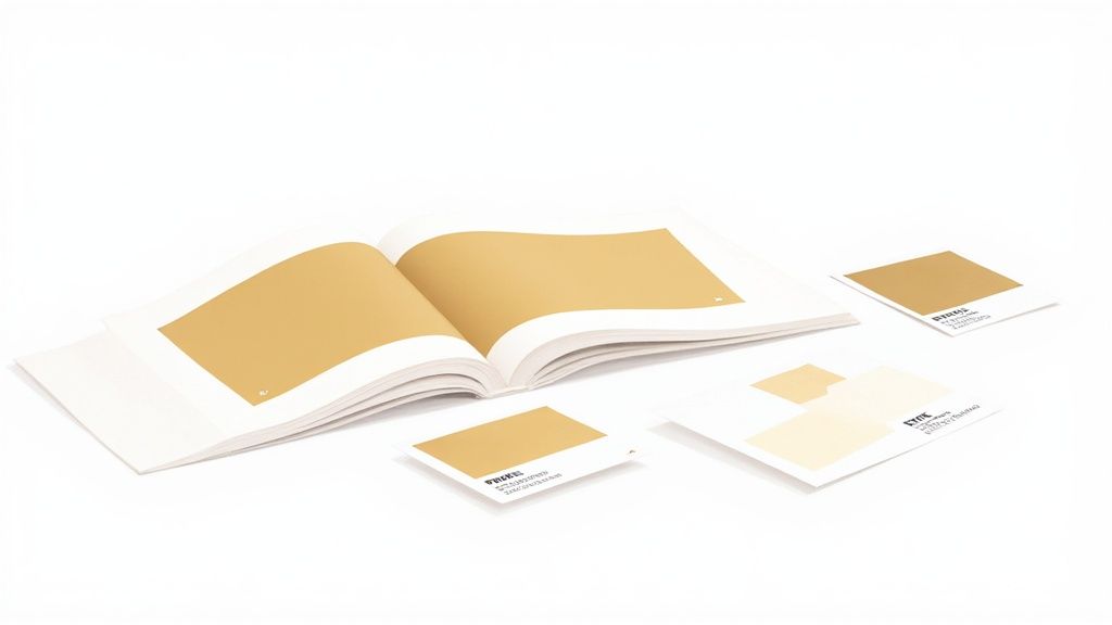
Navigating Pantone Gold Swatches and Codes
Diving into the world of Pantone gold can feel like you’ve stumbled upon a secret menu. There isn’t just one single “PMS color for gold”—there are entire families of them, each created for a specific look and purpose. Getting to know these different swatches is the first step to picking the perfect gold for your project.
The whole system was created back in 1962 by a guy named Lawrence Herbert, who wanted to bring some much-needed order to the chaos of color matching in the printing industry. This universal language helps categorize gold shades into distinct groups, mainly normal metallics and premium packaging metallics, each with its own set of codes.
Designers and printers rely on physical fan decks like these, which is a big deal because a PMS gold you see on a screen is only ever a simulation.
The Two Main Gold Families
When you’re on the hunt for a PMS gold, you'll generally find two main categories. You can spot them by their number range and a letter suffix, like 'C' for coated paper or 'U' for uncoated.
-
Standard Metallics (e.g., PMS 871 C - 877 C): This is the go-to range for most graphic design and print jobs. These shades deliver that classic metallic sheen, running the gamut from light, champagne golds to deep, antique tones. PMS 871 C is a super popular choice for a standard, bright gold.
-
Premium Metallics (e.g., PMS 10121 C): You might have known these as Packaging Metallics. They’re formulated for higher-end projects where you need a little something extra. They offer a more brilliant shine and a smoother finish, getting you much closer to the look of real foil stamping.
If you want to get your gold reproduction just right and keep your brand colors consistent, mastering color management is a skill you can't afford to skip.
Translating Gold for Digital and DTF
Here’s the single most important thing to remember: metallic PMS inks contain actual reflective particles. Your standard CMYK printer, including the ones we use for DTF, can't magically create that physical shimmer. What they can do is create a very convincing simulation using a mix of Cyan, Magenta, Yellow, and Black inks.
Your design software shows you colors using RGB (Red, Green, Blue) and Hex codes for the screen. To get ready for print, those values have to be converted to their closest CMYK match. This conversion is exactly where things can go wrong, turning that vibrant gold on your screen into a muddy, disappointing brown if you're not careful.
Crucial Tip: Always, and I mean always, design your files in the CMYK color space from the very beginning. This gives you a much more realistic preview of the final printed color and helps you avoid nasty surprises.
To give you a head start, here’s a table with a few popular Pantone golds and their approximate, non-metallic digital equivalents. These are great starting points for your DTF designs.
Popular Pantone Golds and Their Digital Equivalents
| Pantone Gold Swatch | Approximate CMYK | Approximate RGB | Approximate Hex |
|---|---|---|---|
| PANTONE 871 C | C=35 M=40 Y=75 K=10 | R=163 G=137 B=88 | #A38958 |
| PANTONE 116 C | C=0 M=15 Y=100 K=0 | R=255 G=210 B=0 | #FFD200 |
| PANTONE 1235 C | C=0 M=31 Y=100 K=0 | R=247 G=181 B=0 | #F7B500 |
While these values help you build a convincing gold effect, nothing beats seeing it for yourself. For maximum confidence, our Auto-build gang sheet builder is the perfect tool. You can easily place several different gold swatches on one sheet for a super low-cost test print. That way, you can be absolutely sure the shade you choose is the exact shade you get on your final product.
The Reality of Printing Metallic Gold
Ever designed something with a brilliant, shimmering gold on your screen, only to see it print as a dull, flat brown on a t-shirt? It’s a common frustration, and the answer comes down to a simple truth: creating color with light is fundamentally different from creating it with ink. A standard printer, including a DTF printer, just isn't built to produce a true metallic shine.
The heart of the problem lies in the inks themselves. Standard printing relies on the CMYK process—layering tiny dots of Cyan, Magenta, Yellow, and Black ink to trick our eyes into seeing a full spectrum of colors. It’s an incredibly versatile method for creating millions of shades, but it's ultimately a simulation. When it tries to make gold, it just mixes yellow and brown tones, giving you a flat representation of the real thing.
Metallic Inks: A Different Breed
True PMS metallic ink, on the other hand, is a completely different beast. It's a spot color formulated with actual, physical metallic particles. Think of it like a specialty paint. These microscopic, reflective flakes are suspended in the ink, and when printed, they sit on the surface and catch the light, creating a genuine shimmer and luster. CMYK ink, being just a blend of colors, can't replicate this physical property.
A standard printer blends colors to create an illusion. A metallic PMS ink uses real reflective particles to create a physical effect. This is the essential difference.
This graphic really drives the point home, showing how a single PMS gold concept has to be translated into different color systems for screens versus print.
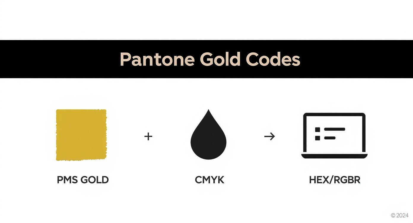
You can see that while the digital codes (RGB/Hex) are direct representations for screens, the CMYK values are just approximations. They’re designed to simulate the color of gold, but they can't deliver its metallic properties.
Simulating the Shine with Faux Gold
So, how do we get a gold look without using specialty inks? We create a convincing illusion, often called "faux gold." This technique involves using clever gradients, highlights, and shadows within your CMYK design to mimic the way light reflects off a real metallic surface. By placing light yellows next to darker, earthy browns, you can create the visual impression of depth and shine.
This workaround is surprisingly effective, especially for apparel printed with DTF transfers. It’s important to set expectations, though. About 30% of all Pantone spot colors just can’t be reproduced accurately with standard CMYK, and metallics are at the top of that list.
For projects where an authentic, unmistakable gleam is non-negotiable, a simulated gold might not cut it. In those cases, clients often turn to specialized services. If you're looking for that real-deal sheen on paper goods, for example, many printers offer dedicated metallic foil printing online that stamps a physical layer of foil onto the product.
But for DTF, the game is all about perfecting the simulation. That’s where our Auto-build gang sheet builder becomes your best friend. It lets you test multiple faux gold gradients and shades on a single, cost-effective sheet, so you can nail down the most believable gold effect before committing to a full run.
How to Get Stunning Gold Effects with DTF
Turning the idea of a PMS gold into a brilliant, tangible print on a t-shirt is where the real fun begins. While your standard DTF printer uses CMYK inks and can't just spit out a true metallic finish, you can absolutely achieve some incredible gold effects with a bit of design know-how and the right materials.
The most common approach is to create what’s known as a simulated gold effect. This is all about using CMYK color values skillfully to trick the eye into seeing gold. By setting up your artwork with the CMYK recipes for a Pantone gold—like the ones we just walked through—you can produce a rich, gold-toned print that looks amazing on fabric. The secret isn't just one flat color; it's all in the gradients, highlights, and shadows that create the illusion of light bouncing off a metallic surface.
Setting Up Your Artwork for Simulated Gold
To get results you can count on, setting up your file correctly is non-negotiable. Think of your design software as your command center for creating a convincing gold look that will translate perfectly to a DTF transfer.
Here are the key steps to lock in:
- Start in CMYK Color Mode: Always begin your design in CMYK. If you design in RGB and convert it at the end, you’re asking for trouble. That beautiful gold you designed can easily turn into a muddy brown, and nobody wants that.
- Use High-Resolution Vector Graphics: For the cleanest, sharpest prints, stick with vector files like .AI or .EPS. Vectors can be scaled up or down without losing a shred of quality, which means your lines and gradients will be perfectly smooth on the final transfer.
- Apply Your Gold CMYK Values: Punch in the specific CMYK percentages for the PMS gold you're aiming for. Use these values to build gradients that move from light, buttery yellows to deeper, earthy tones. This is what creates that realistic metallic sheen.
A well-designed simulated gold effect is never just one flat color. It’s the artful blend of light and dark gold tones that fools the eye into seeing a dynamic, reflective surface, even without a single metallic particle in the ink.
Introducing True Metallic DTF Films
But what if you need that authentic, eye-catching shimmer? For those projects, simulated gold isn't your only play. Specialty metallic DTF films open up a whole new world, giving you a true, reflective finish. These transfers are made with a special foil-like material that bonds to the garment, delivering a brilliant metallic luster that standard inks just can't replicate.
This is the perfect choice for premium apparel lines, merchandise for a special event, or any design where you need the gold elements to be the star of the show. It takes you beyond simulation and gives you a finish with genuine light-reflecting properties. Feel free to explore our full range of custom DTF transfers, including specialty options, to see what's possible for your next design.
Test and Perfect with the Gang Sheet Builder
So, how can you be sure your simulated gold will look just right without having to commit to a huge order? This is exactly why we created our Auto-build gang sheet builder. This tool is a total game-changer for perfecting your designs without breaking the bank.
Instead of ordering a bunch of separate samples, you can group multiple gold designs, color variations, or gradient tests all onto a single sheet. This makes it incredibly easy and affordable to:
- Test different PMS gold simulations right next to each other.
- Compare how a simulated gold looks against a specialty metallic film.
- Knock out various gold-themed designs for different products all at once.
This approach takes all the guesswork out of the process, saving you serious time and money. It gives you the power to see and feel the physical results, ensuring the final product is exactly what you envisioned before you go all-in on production.
A Practical Workflow for Flawless Gold Prints
Getting that perfect PMS gold from a digital file to a finished DTF transfer takes a smart, methodical workflow. When you follow a clear process, you sidestep common headaches like weird color shifts or blurry results. It’s all about closing the gap between what you see on your screen and the physical transfer you’ll press onto the shirt.
It all starts with setting up your design file for success. Getting the technical details right at this stage is what gives you a predictable, professional outcome and takes all the guesswork out of the printing process.
File Preparation Essentials
First things first: set your design software's color space to CMYK. Designing in RGB is just asking for trouble. Those vibrant, light-based colors on your screen will look dull and completely different once they’re converted to ink. If you start in CMYK, you’ll have a much more honest preview of how the final print will look.
Next, you absolutely want to use vector graphics—files like .AI, .EPS, or .PDF. Unlike pixel-based images that get fuzzy when you resize them, vectors stay perfectly sharp no matter how big or small you make them. This is your guarantee that every line, bit of text, and simulated gold gradient will be clean and crisp on the final transfer.
Crucial Reminder: Your screen is not a proof. It just isn't. Monitors are backlit and use RGB light, so even the most perfectly built gold simulation will look different on-screen than it does in print. Always trust the CMYK values in your file, not what your eyes see on the monitor.
Proofing and Perfecting Your Gold
With your file prepped, it's time to proof. How can you be sure your chosen gold simulation will look as good on fabric as you imagine? The smartest, most budget-friendly way is to order a small test swatch before you pull the trigger on a big production run.
This is exactly where our Auto-build gang sheet builder becomes your best friend. It lets you pop several different gold variations—or even your whole design at a smaller scale—onto one sheet for a single, low price. This workflow gives you the power to:
- Select with Confidence: Get your hands on physical transfers, press them, and see which gold shade really works.
- Avoid Costly Mistakes: Catch any issues with your design before you're sitting on a box of 200 unusable transfers.
- Optimize Your Process: Test multiple designs or colorways all at once, saving you both time and money.
Once you’ve got a test swatch you love, you’re ready for the final step. Pressing your transfers with the right settings is the last piece of the puzzle for durability and vibrancy. For a full breakdown, check out our guide on the ideal heat press settings for DTF to make sure your gold prints look incredible and last wash after wash.
Why Nailing Your Gold Color Builds Your Brand
Choosing a gold for your brand isn’t just picking a color; it’s making a statement. Gold speaks volumes—it says luxury, quality, and trust. But that message only lands if it's consistent. A specific, reliable gold ensures your brand is instantly recognizable, whether it’s on a t-shirt, your website, or the box your product comes in.
Think about it. When customers see that same rich, familiar gold every single time, it reinforces their perception of your brand as professional and buttoned-up. It's not just a feeling, either. Studies show that consistent brand presentation can bump up revenue by as much as 33%. Consistency builds trust and makes your brand feel dependable. Imagine if Tiffany & Co. used a different shade of blue for their boxes with every purchase—it would instantly cheapen their iconic identity.
The Real Risk of Getting Gold Wrong
On the flip side, inconsistency can actively wreck your brand’s premium vibe. A vibrant, sharp gold on one product and a dull, muddy brown on another creates a messy and unprofessional look. It screams a lack of attention to detail, which naturally makes customers wonder about the quality of your actual products. This is exactly why locking in your colors with a standardized system like Pantone and working with a quality-obsessed printer is so critical.
Using a consistent PMS gold simulation isn’t just about getting a color right—it’s about protecting your brand’s value and making sure it always looks its absolute best.
This is where a little planning gives you a huge advantage. Our Auto-build gang sheet builder is the perfect tool for this, giving you a super cost-effective way to test and approve your chosen gold shade before you commit to a full production run. By grouping several designs or color tests onto one sheet, you can guarantee every single transfer perfectly matches your brand’s standard. It’s a simple step that turns a color choice into a powerful tool for building a memorable, high-value brand identity—and ensures your gold always shines the way it's supposed to.
Answering Your Top Questions About PMS Gold
Alright, let's dig into some of the most common questions we hear from designers trying to nail that perfect gold look in their DTF projects. Getting these details right from the start saves a lot of headaches later on.
Nailing the Look and Keeping it Fresh
What's the best PMS color for a non-metallic gold on a t-shirt?
This is a big one. For a really punchy, non-metallic gold, you can't go wrong with shades like PANTONE 116 C, which gives you a bright, classic yellow-gold. If you want something a bit deeper with more warmth, PANTONE 1235 C is a fantastic choice, leaning into a richer, slightly orange-gold territory.
The right one really just depends on the vibe you're going for. Just remember to design in CMYK so what you see on screen is a much closer match to the final print. To be absolutely sure, you can easily test both shades side-by-side using our Auto-build gang sheet builder for a quick and cost-effective comparison.
Can I wash shirts with metallic gold DTF transfers?
You bet. Our metallic DTF transfers are built to last and are completely machine washable. To give them the longest life possible, just turn the garment inside out, wash with cold water, and tumble dry on a low heat setting. The only things to avoid are bleach and ironing right on top of the transfer.
What You See vs. What You Get
My gold looks more like a dull brown on my monitor. Will it print that way?
Nope, not usually. This is a classic issue that trips a lot of people up. Your monitor uses the RGB color model and is backlit, which is notorious for making gold simulations look flat, muddy, or brownish. Our printers don't see it that way.
They’re calibrated to read the CMYK values in your file and translate them into a vibrant, gold-like hue. Your best bet is to trust the CMYK numbers from your Pantone simulation, not what your screen is showing you.
The only way to be 100% sure you love the color is to see it in person. Our Auto-build gang sheet builder makes it super cheap and easy to throw a small test swatch onto an order before you commit to a big run.
Ready to finally get those stunning gold prints you've been aiming for, without all the guesswork? At Lion DTF Transfers, we've dialed in our color matching to make sure your designs come out looking exactly how you imagined. Build your custom gang sheet today and see for yourself at https://liondtf.com.