
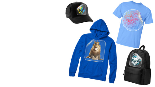


You've approved a sharp design on your laptop, ordered a stack of Comfort Colors 1717 blanks, and watched the first pressed shirt come off the platen looking strangely flat. The artwork wasn't necessarily wrong. The mistake was treating a garment-dyed shirt like a smooth white blank.
Comfort Colors t shirt design works when the artwork respects the fabric's washed surface, relaxed silhouette, and color variation. DTF can produce vivid, detailed graphics on these shirts, but only when you choose contrast deliberately, proof the actual garment color, and test the press process before committing to a full run.
Why Mockups Fail on Garment-Dyed Tees
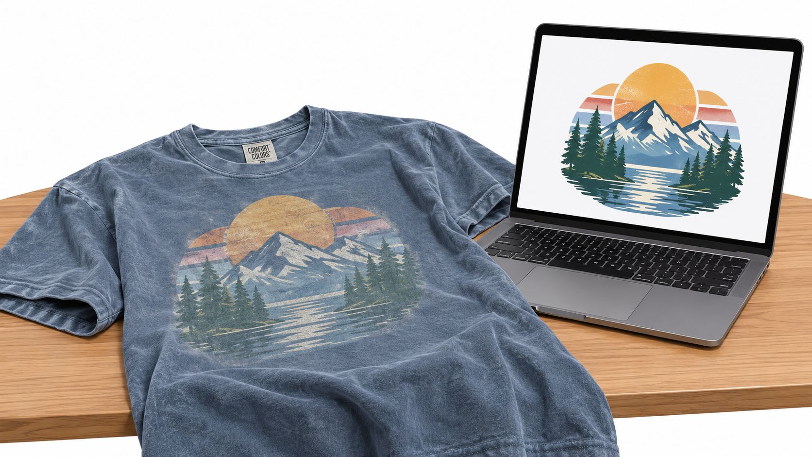
A DTF transfer can look crisp on a white digital mockup, then lose its edge on a Pepper or Blue Jean Comfort Colors blank. The issue is not always the artwork. The shirt's broken-in color, uneven dye appearance, and soft texture become part of the final image, whether the design accounts for them or not.
The 1717 is a 6.1 oz./yd², 100% ring-spun U.S. cotton garment with a relaxed fit and pigment- or reactive-dyed color options, according to the official 1717 product specification. That texture can soften pale gradients, swallow fine dark outlines, and make a distressed graphic look weaker than intended.
The shirt is part of the composition
Comfort Colors traces its origins to 1975 in rural Vermont, where founder Barry T. Chouinard reportedly experimented with garment dyeing using approximately $275 and a washing machine. The brand name was formally introduced in 1995, and Gildan acquired Comfort Colors in 2015. The brand history helps explain why these blanks read as finished garments rather than neutral printing surfaces.
That character suits collegiate lettering, outdoor scenes, faith graphics, event marks, and retro illustrations. DTF artwork should either contrast with the dye or deliberately echo its worn appearance. A clean, opaque transfer can create a useful clash against the fabric, while a lightly distressed transfer can blend into it. The trade-off is control. Subtle artwork needs stronger spacing and contrast to stay legible after pressing.
Build the gang sheet around the actual shirt colors. Group light, dark, and mid-tone versions together, then press a small proof from each group before producing the full sheet. This workflow exposes weak outlines and disappearing highlights early, while preserving the vintage texture as a design asset instead of treating it as a defect.
Practical rule: Proof the design on the exact blank color, not only on a white mockup. Natural light reveals lost contrast that a bright monitor hides.
The relaxed cut also affects visual balance. A broad back graphic may sit comfortably on the 1717, while the same artwork can feel crowded as a small centered print. Judge color, texture, and proportions together before approving the sample.
Setting Up Print-Ready Files for Comfort Colors
Start with the physical garment. The Comfort Colors 1717's listed body widths run from approximately 18.25 inches in S to 29.75 inches in 4XL, while listed body lengths range from about 26.6 to 33.5 inches, according to the manufacturer's published size chart. A single placement can therefore feel generous on S but undersized on 3XL. Set print dimensions against the shirt size, not only the artwork file.
Build separate placement templates
Create templates for the front, left chest, and back. Mark the collar ribbing, shoulder seam, and usable print boundaries so artwork stays clear of reinforced construction areas. The 1717 includes a rib collar, shoulder-to-shoulder twill tape, topstitching, and a signature twill label. These details can affect how comfortably a DTF transfer sits, so review the 1717 construction and measurement specification before approving placement.
Use a size proof for each meaningful size category. The artwork can remain unchanged, but its physical dimensions should be checked across the range. The listed body-length and chest-width tolerance is 2 inches, so production teams should allow for variation instead of treating every blank as identical.
A good template also protects the design from the shirt's texture. Garment-dyed cotton can make a clean transfer look unexpectedly stark, while a distressed graphic may merge too far into the vintage surface. Leave enough clear space around lettering and test the intended scale on the actual blank color.
Prepare the artwork correctly
Keep the master logo and lettering in vector format. Convert text to outlines so missing fonts cannot change the design, and use vector shapes for marks that need sharp edges. Export a transparent 300-DPI raster file at final physical size, or supply a vector-compatible file when the workflow supports it.
Avoid hairline details, subtle gradients, and dark artwork with weak contrast. The dyed surface can reduce separation that looked clear on screen. Stronger line weight and a simplified silhouette usually produce a cleaner DTF result than adding more distressed texture.
For production choices, consult this print-ready file format guide. Before building a gang sheet, place the finished artwork over a calibrated preview of each shirt color and inspect it at intended size. Then proof one transfer from each color family. If the design only works when enlarged on a monitor, it is not ready for pressing.
Matching Artwork to Garment Color Families
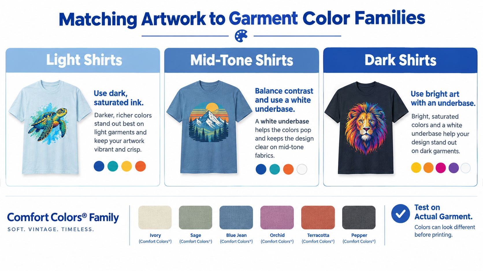
The same DTF graphic can look completely different across a Comfort Colors color run. A light shirt gives the transfer more visual authority. A dark, washed shirt competes with the design for contrast. Mid-tone colors sit between those extremes and often expose weak color choices most clearly.
The 1717 separates its palette into pigment-dyed and direct/reactive color groups. That distinction matters because garment color changes perceived saturation. Pepper, Blue Jean, and Moss can mute delicate artwork, while lighter colors tend to give thin outlines and softer palettes more room.
Compare the design by shirt family
| Garment family | Artwork that usually holds up | Main risk |
|---|---|---|
| Light shirts | Dark, saturated ink and controlled fine detail | Artwork can look harsher than intended |
| Mid-tone shirts | Balanced contrast with a deliberate white underbase | Colors may appear neither bright nor muted enough |
| Dark shirts | Bright artwork, stronger lettering, and a dependable underbase | Low-contrast details can disappear into the fabric |
On a lighter Ivory or Bay-style base, delicate outlines may survive if the artwork has enough tonal separation. On a dark pigment base, increase letter weight, simplify linework, and choose warmer or brighter ink colors. That approach doesn't mean every dark shirt needs fluorescent artwork. It means the design must create its own edge against the garment.
Don't confuse vintage with excessive distressing. A heavily distressed file placed on a washed shirt can lose both its small marks and its hierarchy. The fabric already supplies irregularity, so a cleaner graphic may produce a more convincing aged result than another layer of artificial wear.
Use the Pantone-to-CMYK color conversion guide when translating brand colors into a practical print palette, then inspect the result on the chosen blank. Digital color values are a starting point, not proof that a muted garment will reproduce the intended mood.
Testing DTF Adhesion on Garment-Dyed Cotton
A strong design can still fail at the press. Garment-dyed cotton retains a soft, textured finish, and that texture affects contact, opacity, and edge adhesion. A controlled sample tells you more than confidence based on a previous shirt color.
Start by lint-rolling the blank, then pre-press it briefly to remove moisture and flatten the surface. Position the transfer carefully, apply it using the supplier's validated settings, and follow the correct peel timing for the film construction. A second fixation press should only be used when the transfer system specifies it.
Test across the actual palette
Test at least one light pigment color, one dark pigment color, and one reactive-dyed color before running production. Inspect:
- Fine text: Check whether small counters remain open and readable.
- Edges: Look for lifting, incomplete contact, or a halo around the transfer.
- Opacity: Confirm that the garment color isn't overpowering the intended artwork.
- Color shift: Compare the pressed result with the approved proof.
- Laundered finish: Wash a sample before making durability claims.
Record the press model, platen pressure, temperature, dwell time, peel timing, shirt color, and transfer lot. That record turns a vague failure into a repeatable correction. If one color behaves differently, you can adjust the process for that blank instead of changing every file.
Quality-control note: Insufficient pre-pressing can leave moisture and wrinkles under the transfer. Excessive pressure can create a visible halo. Neither problem is reliably visible in a digital mockup.
The garment is pre-shrunk through dyeing and washing, and the manufacturer describes it as having nearly no expected home shrinkage, as noted in the retail 1717 product information. That helps with dimensional consistency, but it doesn't guarantee a particular transfer's wash performance. Publish durability claims only after testing the exact blank and decoration combination.
Streamlining Production with an Auto-build Gang Sheet Builder
Once the artwork and sample settings are approved, the next challenge is repetition. Comfort Colors orders often need several print sizes, shirt colors, or placement types. Manually rebuilding each layout wastes time and creates opportunities for inconsistent dimensions.
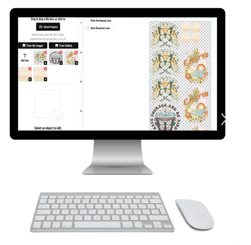
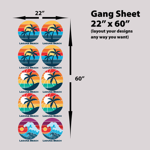
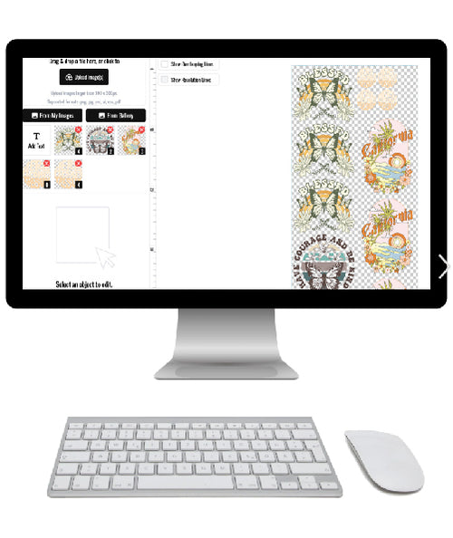
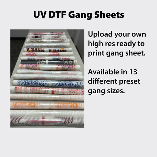
An Auto-build gang sheet builder lets you arrange multiple design sizes and colorway samples efficiently on one sheet. You can place a front graphic, left-chest mark, sleeve detail, and back print together while preserving the physical dimensions you already approved. That reduces unused transfer space and improves cost effectiveness per design.
Use the sheet as a production control
Name each design by placement and size before adding it to the layout. Keep a master version of the art, then create clearly labeled variants for the front, left chest, and back. This prevents the common shop error of pressing a correctly designed graphic at the wrong physical size.
For a team order, a useful sheet might contain the approved left-chest mark, the main back graphic, and a few replacements. For an e-commerce collection, it can hold the same artwork prepared for light, mid-tone, and dark garment families. The builder becomes more than a space-saving tool. It preserves the decisions made during proofing.
Watch this DTF transfer preparation video for a visual look at organizing artwork before pressing.
The best workflow is simple: approve one sample, lock the dimensions, add the variants to the Auto-build gang sheet builder, and label the output for production. Don't resize individual transfers casually at the press. If a customer needs a change, update the master layout and generate a new controlled version.
Pressing Settings and Care Instructions That Last
A garment-dyed Comfort Colors tee can make a clean DTF transfer look too sharp against its broken-in texture. The right press routine helps the film bond without flattening the shirt's vintage character. For 100% cotton, published guidance recommends 285–325°F (140–163°C), medium-to-firm pressure of approximately 40–60 psi, and a primary press time of 10–15 seconds. Pre-press for 2–5 seconds to remove moisture and wrinkles. Use the DTF heat press settings guide as a reference, while following the transfer supplier's validated instructions first.
Film construction determines the peel. Remove hot-peel film immediately while warm. Cold-peel film must cool fully before removal. If the transfer system calls for it, finish with parchment paper or a Teflon sheet for 3–8 seconds. That final pass can improve durability and help the graphic settle into the cotton surface.
Protect the finished garment
A durable transfer still needs sensible garment care. Harsh heat, bleach, or direct ironing can damage the dyed finish and the decoration, so publish care instructions with every product listing.
The published 1717 care guidance recommends:
- Wash cold: Use a maximum temperature of 30°C (90°F).
- Skip bleach: Bleach can affect the dyed finish and decoration.
- Dry low: Use low heat in the tumble dryer.
- Iron carefully: Keep ironing, steaming, or dry ironing on low heat.
- Avoid dry cleaning: The listing does not recommend it.
Turn the shirt inside out before washing, and keep direct heat away from the transfer. Before a large run, test solid areas, fine details, and high-contrast artwork on the actual garment color. That check catches adhesion or visual clashes before they become returns.
Turning Comfort Colors Design into Repeatable Merchandise
Reliable Comfort Colors merchandise comes from treating design, garment selection, pressing, and fulfillment as one system. The fabric supplies the vintage character. Your artwork should add hierarchy and identity without competing with that texture.
For small runs, start with one approved color and one placement. For teams or schools, create a placement sheet that shows the physical dimensions for each design location. For e-commerce, publish actual garment measurements, the model's height and size, the intended silhouette, and care instructions alongside the product photos.
Keep the decisions visible
A repeatable production folder should contain:
- Approved artwork: Outlined text, vector logos, and transparent final-size exports.
- Color proofs: Screenshots or calibrated previews for each garment family.
- Press record: Temperature, pressure, dwell, peel timing, and transfer lot.
- Placement guide: Front, left-chest, back, and any sleeve dimensions.
- Care copy: Washing and drying instructions that match the blank listing.
- Gang-sheet layout: A locked file containing approved size and color variants.
The Auto-build gang sheet builder connects these decisions to fulfillment. It helps arrange repeated marks and multiple design sizes without manually rebuilding every order, which reduces waste and supports cost-effective production. It also makes it easier to keep a replacement transfer or alternate colorway with the main order when the job requires consistency.
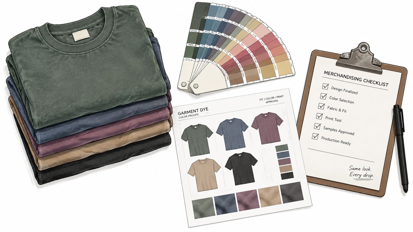
The practical standard is straightforward. Choose artwork that survives the garment color, proof it at final size, test adhesion on representative blanks, lock the settings, and organize the approved variants in one controlled layout. That's how a one-off print becomes dependable merchandise for a shop, team, brand, or event.
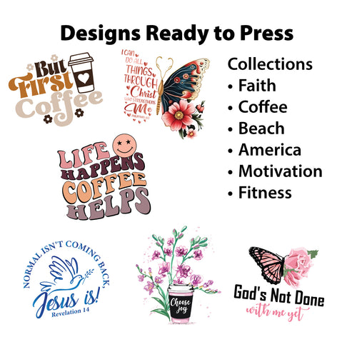
Lion DTF Transfers offers vibrant DTF transfers, custom gang sheets, ready-to-press collections, and support with file preparation and pressing workflows. Visit Lion DTF Transfers to build an efficient gang-sheet order and turn your approved Comfort Colors artwork into consistent, press-ready merchandise.