



You can have the right artwork, a clean gang sheet, and a press that's been dialed in, then still end up with a print that looks dull, puckered, or a little cooked because the blank wasn't up to the job. That's the part a lot of buyers learn the hard way. The best shirts for DTF transfers aren't chosen by brand name first, they're chosen by how the fabric behaves under heat, how stable the surface is, and how much risk you're willing to take on scorch or dye migration.
Most bad outcomes come from treating the shirt like a passive surface. It isn't. Cotton, polyester, and blends all react differently to pressure and temperature, and the wrong choice shows up fast in the finished print. If you're ordering for retail merch, team gear, hobby runs, or a shop that needs repeatable results, the blank matters as much as the transfer itself.
Why the Right Shirt Makes or Breaks Your DTF Print
The classic moment is easy to recognize. You open the box, the transfers look perfect, the heat press is warmed up, and then the shirt either comes off looking crisp and retail-ready or it comes off with a rough edge, a dull face, or a patch that looks like it's been overheated. The transfer didn't suddenly forget how to work, the blank decided the outcome.
The shirt is part of the print system
DTF works best when the transfer, the press, and the fabric all agree with each other. A shirt that handles heat well, presents a smooth enough surface, and matches the intended finish will make the design look sharper and last longer. A shirt that fights the process can still accept the print, but the result usually costs more in reprints, testing, and customer complaints.
Practical rule: If the blank feels wrong for the application before you press it, it usually won't get better after you press it.
That's why most experienced buyers stop asking, “What's the single best shirt?” and start asking, “What's the right substrate for this job?” The answer changes depending on whether you're chasing premium retail hand-feel, sportswear performance, or budget-friendly volume.
Three things decide the outcome
The first is fabric behavior under heat. The second is weight and construction, because a shirt that's too light or too unstable won't hold the image cleanly. The third is color and finish, since dark synthetics and textured fabrics introduce more risk than a smooth white cotton tee.
Once you start judging blanks that way, the decision gets simpler. You stop sorting by hype and start sorting by how the shirt will behave in the press, on the body, and after a few wash cycles. That shift saves time every time you're building a gang sheet, because the print plan and the blank plan stop working against each other.
Cotton, Polyester, and Blends Explained

Cotton is usually the safest place to start for DTF. 100% cotton tends to hold ink well and keep color looking solid, which is why it stays the default choice for buyers who want predictable results. On a smooth, medium-to-heavy tee, the surface gives the adhesive a steadier place to bond, which helps the print stay crisp and lowers the chance of distortion during pressing.
Cotton also gives you more room for error. If the press runs a little uneven or the garment has minor texture, the shirt usually forgives that better than a slick synthetic.
Why polyester needs more caution
Polyester can produce a clean athletic finish, but it also raises the risk level quickly. Heat can cause scorching and dye migration, especially on darker polyester shirts, and that can change how the print looks even if the transfer itself was applied correctly. A white underbase can also shift in appearance if the press runs hotter than the fabric wants.
For sportswear, moisture-wicking garments, and uniforms, polyester still makes sense. The trade-off is tighter heat control and more testing before you fill a large order. If you want the least drama on a new job, cotton usually gives you a more forgiving press path. For a fuller fabric comparison, the cotton vs. polyester guide for DTF transfers is a useful reference while you source blanks.
Blends are the practical middle ground
Cotton-poly blends sit between the two. They usually give a workable mix of softness, durability, and heat tolerance, while staying less demanding than full polyester. That is why you see them often in everyday merch, school apparel, and general-purpose basics.
Tri-blends are worth considering when hand-feel matters more than absolute simplicity. They are common in fashion-oriented apparel, but the surface can feel less uniform than a standard midweight cotton tee, so you give up some consistency in exchange for a softer drape. That trade makes sense for lifestyle brands and less sense for high-volume jobs where repeatability matters most.
Quick selection logic
- Choose cotton when you want the safest, most forgiving print path.
- Choose polyester when athletic performance matters and you can control heat tightly.
- Choose blends when you want a practical middle ground for mixed customer needs.
A simple rule covers most buying decisions. Cotton is the easiest to make look good, polyester is the easiest to overheat, and blends split the difference in a way that often works well for commercial runs.
Weight, GSM, and Knit Construction
If fabric type is the first decision, weight is the part that decides whether the press feels controlled or fussy. In shop talk, that usually means checking ounces per square yard or GSM, because those numbers tell you how much structure the shirt keeps under heat. For DTF, a practical target sits around 5.5 to 6.5 oz/yd², or roughly 180 to 220 GSM source. That range lines up with the usual advice to choose medium-to-heavier blanks for better ink adhesion and sharper image edges.
Why midweight shirts print cleaner
A shirt in that range gives the adhesive powder a steadier base to bond to. The fabric is less likely to collapse under the press, and the print edges usually stay cleaner because the face of the garment is not shifting as much. For buyers comparing blanks, that stability is the reason midweight tees keep coming up again and again.
A good reference point is the Gildan 5000 Heavy Cotton at 5.3 oz source. It sits close enough to the common benchmark to show why this part of the market shows up so often in promotional wear, retail basics, and team apparel. It is not the softest shirt on the rack, but it is a familiar production blank that many print shops can run without surprises.
Construction matters as much as the number
Two shirts can share the same weight and still press very differently. A smoother knit, tighter construction, or a better ring-spun or combed finish usually gives the transfer a cleaner landing zone than a rough open-end tee. Side seams, pre-shrunk construction, and a stable cut also matter because they help the garment hold its shape during pressing and after washing.
A shirt that looks cheap on the rack often looks cheaper after pressing, because the texture shows through the print.
That is why ultra-light shirts are risky for detailed work. They can make ink look like it sinks into the surface, and small edges may appear feathered instead of crisp. Very heavy garments create a different trade-off, since they can feel stiff and less comfortable for casual wear, so the best choice is usually the one that balances hand-feel with stability. For a fuller breakdown of how shirt behavior changes under heat, the heat press settings for DTF guide is a useful companion while you compare blanks.
Quick Reference Shirt Weight vs DTF Performance
| Weight (oz/yd²) | GSM Range | Best For | DTF Notes |
|---|---|---|---|
| Light | Below the midweight benchmark | Fashion-light tees and delicate hand-feel | Can feel less stable under heat |
| Midweight | Around 5.5 to 6.5 oz/yd² | General-purpose merch, hobby runs, team basics | Strong balance of stability and comfort |
| Heavy | Above the midweight benchmark | Workwear, durable basics, some premium streetwear | Stable for pressing, can feel stiffer |
The most useful habit is to stop buying shirts by feel alone. Check the spec sheet, check the construction, and make sure the blank matches the kind of print you need to sell.
Heat Press Settings by Fabric Type

DTF isn't just about choosing a shirt that can handle heat, it's about matching the blank to the right press window. Cotton is commonly pressed at 270 to 280°F, cotton blends at 260 to 270°F, and polyester at 240 to 250°F to reduce scorch risk and dye migration source. Those ranges exist for a reason, and the garment often tells you when you've ignored them.
Pressing cotton without starving the adhesive
Cotton is usually the easiest substrate to work with because it tolerates more heat than polyester and doesn't carry the same dye migration risk. The danger on cotton is usually pressing too cool, which can leave the adhesive underworked and the edges vulnerable to lift. A clean cotton press should feel intentional, not timid.
Polyester needs lower heat and more discipline
Polyester is less forgiving. Press too hot, and you can cook the fabric or wake up dye migration that wasn't obvious before pressing. That's why the lower temperature window matters, especially on dark athletic shirts where color shift can ruin an otherwise good transfer.
Practical rule: If the shirt is synthetic and dark, start with the lowest safe press window and test before you scale.
The typical DTF sequence
A common application guide uses 270 to 280°F for 10 seconds with medium-high pressure, then a 5 to 10 second final press to improve wash resistance source. That final press matters because it helps settle the adhesive and make the surface feel more finished.
The key is not to treat those settings as universal. A press that works beautifully on cotton can be too aggressive for polyester, and a safe polyester setting may be too soft for a heavy cotton tee. Shirt choice and temperature choice belong together.
For a more detailed operational breakdown, this DTF heat press settings guide is useful when you're tuning your setup.
Settings that make sense in practice
- Cotton shirts: Use the hotter end of the safe window when the fabric is sturdy.
- Cotton-poly blends: Stay in the middle and watch for a clean edge bond.
- Polyester shirts: Keep heat lower and test for dye migration before production.
That's the part many beginners miss. The fabric doesn't just survive the press, it changes how the press behaves.
Best Shirts by Buyer Profile
The best blank for a fashion brand isn't automatically the best blank for a soccer team. A home crafter doesn't need the same margin structure as a shop fulfilling 200-unit runs, and a school order has different durability expectations than a limited merch drop. Matching the shirt to the buyer profile keeps the DTF process efficient and keeps the finished product aligned with what the customer wants.
Retail merch brands
Retail merch usually benefits from ring-spun cotton in the 5.5 to 6 oz neighborhood. That gives you a smoother hand-feel and a more premium presentation than a rough budget tee, which matters when the shirt itself is part of the brand story. Cotton also gives the safest path when the goal is crisp artwork and broad color consistency.
Sports teams and schools
Sports teams and school programs often do better with poly-rich blends or polyester performance blanks. Those garments are built around active use, so the print has to sit on top of a shirt that already handles motion and repeat wear. Because polyester brings dye-migration risk, especially on darker colors, the pressing setup has to stay conservative.
Hobbyists at home
Hobbyists usually want forgiving results more than anything else. A midweight 100% cotton tee is the easiest place to start because it gives the press a stable base and doesn't demand constant temperature anxiety. That matters when you're learning placement, peel timing, and pressure control at the same time.
Print shops scaling production
Print shops need blanks that stay consistent across large, mixed-order runs. Midweight cotton and cotton-poly options work well because they cover a wide range of customer artwork without forcing the operator to relearn the press for every shirt type. Shops also benefit from blanks that don't create avoidable reprints.
A simple buyer map looks like this:
- Retail merch: smoother ring-spun cotton, premium hand-feel, cleaner art presentation.
- Sports teams: performance-focused poly or blends, lower heat, careful color checks.
- Hobbyists: midweight all-cotton, predictable pressing, fewer surprises.
- Print shops: versatile blanks that can handle varied artwork and volume.
If you're buying blanks for a mixed audience, choose the shirt that's easiest to press consistently, not the one that sounds trendiest in a catalog. Consistency is what keeps the unit economics sane.
Troubleshooting Common Shirt-and-Transfer Problems
The fastest DTF fixes usually come from reading the shirt, not blaming the artwork. Most shirt-related problems show up in a few predictable ways, and once you know the symptom, the cause is usually obvious. The key is to diagnose before you reprint.

Common failure patterns and what they usually mean
- Edge lift: Usually a press that ran too cool, or a shirt surface that was too smooth for the transfer to bite properly.
- Dye migration on polyester: Usually too much heat or too much dwell time on a synthetic blank.
- Image distortion: Usually uneven pressure or a stretchy knit that moved during pressing.
- Poor adhesion on heavyweight fleece or canvas: Usually not enough pressure or insufficient time for the adhesive to settle.
- Cracking after wash: Usually an under-cured adhesive or the wrong peel behavior for that fabric.
The myth that trips up a lot of new buyers is that DTF needs pre-treatment the way DTG does. It doesn't. That's one reason the workflow stays simpler when the blank is chosen correctly and the press settings are matched to the fabric instead of guessed.
Reading the shirt before you press
Dark shirts demand more attention than light ones, especially when the fabric is synthetic. The white underbase can look perfect on the press and still shift if the garment runs hot enough to trigger dye migration. Textured fabrics create a different problem, because they can prevent even contact and make the print look less crisp even when the transfer itself was fine.
If the blank is textured, stretchy, or synthetic, slow down and test. Speed costs more than caution when you're reprinting.
The cleanest fix is usually the simplest one. Lower the temperature on polyester, increase pressure where the surface is too firm, and test on a single shirt before you commit to a stack. Most failures aren't mysterious, they're the shirt telling you the setup was wrong.
Pre-Production Testing Checklist
Before a bulk run, the smartest move is to waste one shirt, not fifty. A single test gives you a live answer on adhesion, color, peel behavior, and shirt reaction under heat. That's especially important when you're changing blanks, since two tees that look similar on a product page can behave very differently in the press.

A simple test routine
- Press one shirt first. Use the actual transfer film and the exact blank you plan to sell.
- Inspect the result closely. Check adhesion, edge sharpness, color vibrancy, and hand-feel.
- Run a wash-and-dry cycle. That tells you whether the bond is holding the way you need it to.
- Approve or adjust. Save the winning time, temperature, and pressure so you can repeat it later.
That small discipline makes production more repeatable. It also makes it easier to spot whether the problem is the shirt, the press, or the transfer film itself.
Why batching helps the economics
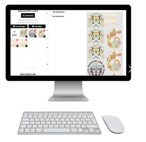
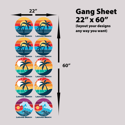
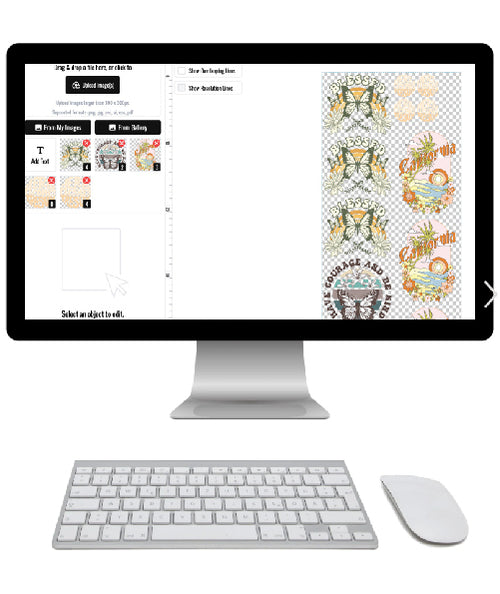
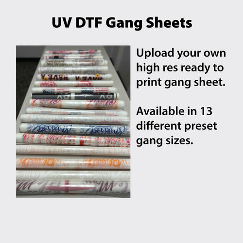
If you're only pressing a few pieces, using an auto-build gang sheet builder is an easy way to cut waste and make the most of each sheet. By nesting multiple designs onto one layout, you reduce underused film and keep the cost per print under better control. That matters for small shops, but it matters just as much for hobbyists who don't want to pay full sheet cost for a tiny run.
For a walkthrough on pressing technique, this how to press DTF transfers guide pairs well with a test-first workflow.
The benefit of testing is confidence. Once you've validated the shirt, the print, and the settings, production stops feeling like a gamble and starts feeling like a process.
Bringing It All Together for Consistent Results
A good DTF run starts with the blank, not the artwork. Match fabric family, weight/GSM, and press temperature to the shirt you are using, because those three variables control how the adhesive lands and how the print survives wear and washing. Cotton is the safest starting point. Blends give you a practical middle ground. Polyester can work well, but it asks for tighter heat control and more attention to dye migration.
Midweight shirts are usually the most dependable place to begin. A blank in the 5.5 to 6.5 oz/yd² range, or roughly 180 to 220 GSM, gives the transfer a steadier surface than a very light tee, and it usually behaves more predictably under heat. Very thin shirts can feel soft, but they also leave less margin for error if the press runs hot or the adhesive has to bond to a less stable knit. That trade-off matters more than brand name.
Once the shirt choice is settled, the next gain comes from how you build the order. An auto-build gang sheet builder helps you place multiple designs on one sheet, use more of the film you paid for, and keep production costs under control. That matters for a print shop running mixed jobs, and it matters just as much for a hobbyist trying to avoid wasting transfer material on a small run.
The practical rule is simple. Choose the shirt for fabric behavior, choose the press settings for that shirt, and choose the layout tool for the size of the order. Follow that sequence every time, and you get fewer surprises at the press, fewer bad pulls after washing, and a process that is easier to repeat.
A CTA for Lion DTF Transfers: if you're ready to stop guessing and start pressing with more consistency, build your next run with a blank that matches the fabric guidance above and use an auto-build gang sheet workflow to keep waste down, costs tighter, and turnaround easier to manage.