


Ever spotted a t-shirt where the design just looked… off? Maybe it was comically small or awkwardly huge. It's a common slip-up in shirt design size that can make even the coolest artwork look amateur. Nailing the ideal size isn't about memorizing a single number; it's about creating a perfect balance between the shirt, the placement, and the design itself.
Get it right, and the final product looks intentional, professional, and something people actually want to wear.
Why Your Shirt Design Size Is So Important
Mastering shirt design sizing is less about guesswork and more about crafting a visually balanced, professional product. Think of it as the foundation of your apparel project. Getting it right from the start prevents costly reprints and keeps your customers happy. A perfectly sized design just screams quality before anyone even reads the text.
This guide is here to tackle that exact problem. We’ll walk through the essentials, starting with core concepts like placement and garment type, then diving into the nitty-gritty of prepping your files. Our goal is to give you a clear roadmap that saves you time, money, and headaches.
The Foundation of Professional Apparel
The right size and placement are non-negotiable for a few key reasons. A massive graphic on a small youth tee will wrap around the sides, completely distorting the art. On the flip side, a tiny logo on a 3XL shirt just gets lost, killing its impact. Proper sizing makes sure your message is clear and your branding hits the mark.
A few key things to keep in mind:
- Visual Balance: The design should complement the shirt, not overpower it or shrink into the background.
- Garment Type: A hoodie’s front pocket or a polo’s buttons completely changes the available print area. You have to work around them.
- Target Audience: It’s obvious, but a design for a toddler needs totally different proportions than one for an adult.
And once you’ve nailed the perfect scale and placement, you need to show it off. Great T-Shirt Product Photography is the final step to highlighting all the hard work you put into getting the details right.
Ultimately, getting the sizing right from the start is the key to creating apparel people actually want to wear. It’s a direct reflection of your brand's attention to detail and commitment to quality.
For anyone using Direct to Film transfers, these principles are even more critical. To get a better handle on this game-changing print method, check out our guide on the essentials of DTF printing.
And for a ridiculously easy and cost-effective way to prep multiple designs, our Auto-build gang sheet builder automates the entire layout process for you, saving you a ton of time.
Standard Print Dimensions and Placement Guide
Getting your shirt design size right is like choosing the perfect frame for a picture—it has to complement the artwork, not overpower it. This guide is your cheat sheet for taking the guesswork out of sizing and placement for your most common print jobs. We’ll cover the industry-standard dimensions that give you a reliable starting point for any project.
But this isn't just a list of numbers. We'll get into the why behind these recommendations, so you understand why a youth shirt needs different proportions or how a sleeve's unique shape impacts your printable area. This is the kind of practical knowledge that builds the confidence to scale your designs perfectly, every single time.
The infographic below really nails the core principles that make a shirt design work: balance, quality, and placement.
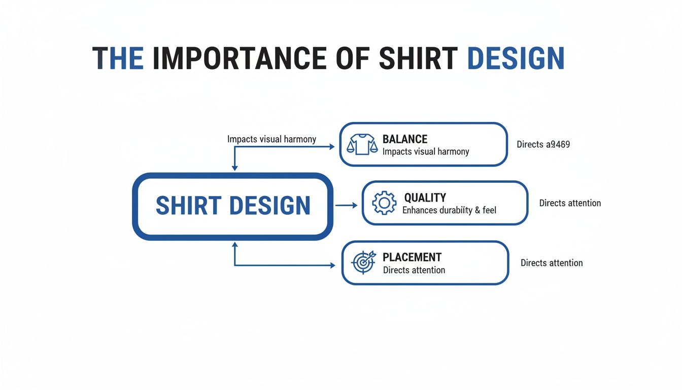
Think of these elements working together to create a final product that looks professional and just feels right.
Recommended Shirt Design Sizes by Placement and Garment Type
To make things easy, here’s a quick-reference table with the go-to dimensions for the most common T-shirt placements. These are the numbers we trust for our own projects and are a solid foundation for yours.
| Placement Location | Adult Unisex Size (S-XL) | Youth Size (M-L) | Toddler Size (2T-4T) |
|---|---|---|---|
| Full Front | 10"–12" wide | 8"–10" wide | 5"–6" wide |
| Center Chest | 6"–8" wide | 5"–6" wide | 4"–5" wide |
| Left Chest/Pocket | 3"–4" wide | 2.5"–3" wide | 2"–2.5" wide |
| Full Back | 10"–14" wide | 8"–12" wide | 6"–8" wide |
| Upper Back (Yoke) | 4"–6" wide | 3"–5" wide | 2"–3" wide |
| Short Sleeve | 3"–3.5" wide | 2.5"–3" wide | 1.5"–2" wide |
Keep this table handy, but remember to always use your best judgment. A design with a lot of height might need to be narrower to avoid looking stretched.
Full Front and Center Chest Designs
A full front design is the boldest statement you can make on a shirt. It’s a huge canvas, perfect for detailed artwork, band merch, or expressive graphics. The goal is to fill the space without making the design feel cramped or overwhelming. When you get it right, a full front print is impossible to ignore.
Center chest prints are the opposite—smaller and more focused. This placement is ideal for brand logos, minimalist art, or a few clean words. It draws the eye to a specific point, creating a classic look that works on just about any garment.
- Standard Adult Full Front: 10-12 inches wide is a great starting point.
- Oversized Adult Full Front: To get that modern, streetwear vibe, you can push it to 12-15 inches wide.
- Youth Full Front: Scale this way down to 8-10 inches wide to keep it proportional on a smaller shirt.
- Adult Center Chest: Keep it tight at 6-8 inches wide for a clean, balanced look.
Left Chest and Pocket Logos
The left chest is the gold standard for professional and branded apparel. It’s the go-to spot for company logos, school emblems, or any subtle design that adds a touch of class. The idea here is visibility without distraction, creating a polished look on polos, hoodies, and crewnecks.
A great rule of thumb for placing a left chest logo is to align the design's vertical center with the edge of the collar. This trick helps it sit naturally on the pectoral muscle instead of drifting awkwardly toward the armpit.
For an even more granular look at sizing across different garment types, check out our comprehensive DTF sizing chart. It’s packed with specific recommendations.
Full Back and Upper Back Designs
The back of a shirt is your largest, most uninterrupted canvas, making it perfect for designs that need room to breathe. Think of it as a walking billboard—ideal for event staff shirts, team jerseys with names and numbers, or sprawling artwork that deserves a grand stage.
An upper back design, often called a "yoke" print, is a smaller, more subtle alternative. Placed just below the collar, it’s fantastic for branding, website URLs, or small taglines that add a professional finishing touch without taking over the whole back.
- Standard Adult Full Back: The sweet spot is typically 10-14 inches wide.
- Youth Full Back: Adjust downward to 8-12 inches wide to maintain the right proportions.
- Upper Back (Yoke): A smaller design of 4-6 inches wide looks sharp here.
Sleeve and Specialty Placements
Sleeve prints are a fantastic way to add secondary branding or a bit of creative flair. Whether it’s a small logo on a short sleeve or a vertical design running down a long sleeve, this placement adds another layer of detail that makes a garment feel complete. The trick is to work with the sleeve's tapered shape and stay within its natural boundaries.
It's no surprise that getting sizing right is a big deal. The global T-shirt market was valued at an incredible $169.1 billion in 2021 and is projected to hit $195.6 billion by 2025. This kind of growth shows just how crucial proper shirt design size is for creating products people actually want to wear.
For those more complex projects, our Auto-Build gang sheet builder makes life so much easier. Just upload multiple designs of different sizes, and it will automatically arrange them to maximize every inch of film, providing an easy-to-use and cost-effective solution.
Preparing Your Artwork for Flawless DTF Prints
A fantastic shirt design can fall flat if the digital file isn’t prepared correctly. This is the crucial step where your on-screen art becomes a press-ready file, and getting the technical details right is the secret to a flawless Direct to Film (DTF) transfer.
Think of this process as your final quality control check. It’s what ensures the vibrant design on your monitor translates perfectly onto the fabric.
You don’t need to be a graphic design wizard to get this right. It’s all about following a few simple rules that make a world of difference in the final print. We'll demystify the technical specs and use simple analogies to make even the most complex topics clear and easy to follow.
The Importance of High Resolution
The single most important factor for a sharp, clear print is the resolution of your file, measured in DPI (dots per inch).
Imagine resolution as the level of detail in a photograph. A low-DPI image is like a blurry, pixelated photo you'd find on an old website. A high-DPI image is crisp, sharp, and clear, just like a high-definition movie.
For DTF printing, the industry standard is 300 DPI. If you try to print a file with a lower resolution, like the common web standard of 72 DPI, the design will look fuzzy, blocky, and completely unprofessional. You can’t just increase the DPI on a low-quality image and expect it to magically look better; the quality has to be there from the very start.
Always start your design process with a canvas set to 300 DPI at the final intended shirt design size. This foundational step prevents quality loss and ensures your artwork has the detail it needs for a stunning, professional-grade print.
Choosing the Right Color Mode
Another critical step is setting the correct color mode. Your computer screen creates colors by mixing red, green, and blue light—this is known as RGB. Professional printers, on the other hand, create colors by mixing cyan, magenta, yellow, and black ink, a mode called CMYK.
Because the two systems create color differently, what you see in RGB on your monitor might not print exactly the same in CMYK. To get the most accurate color representation and avoid unexpected shifts in your final print, it’s best practice to design your files in the CMYK color mode from the beginning.
Vector vs. Raster: Which Is Best?
Your design files will generally fall into one of two categories: raster or vector. Understanding the difference is key to choosing the right format for your project.
-
Raster Images: These are made of tiny pixels, just like a photograph. They're great for detailed, colorful artwork with complex gradients. Common raster file types are PNG, JPG, and TIFF. The main drawback? They can’t be scaled up without losing quality and becoming pixelated.
-
Vector Images: These are created with mathematical equations, lines, and curves. Common vector file types include AI, EPS, and SVG. Their biggest advantage is infinite scalability—you can make a vector logo the size of a postage stamp or a billboard with zero loss in quality.
For DTF printing, vector files are often preferred for logos, text, and solid graphics because they produce the sharpest possible edges. However, high-resolution (300 DPI) raster files, especially PNGs with transparent backgrounds, work perfectly for photographic or painterly designs.
Setting Up Your File for Success
Before you send your artwork off to print, there are a couple of final checks to perform.
First, ensure your design file has a transparent background. DTF printers will print any background color present in the file, so unless you want a solid box printed behind your art, save it as a PNG or another format that supports transparency.
Additionally, always convert any text in your design to outlines or curves. This locks the font into a shape, ensuring it prints exactly as you intended, even if the printer doesn't have that specific font installed on their system. This small step prevents font substitution errors that can ruin an entire batch of prints.
Making these technical checks a standard part of your workflow will guarantee consistent, high-quality results. And for those with multiple designs, our Auto-build gang sheet builder streamlines the process further by automatically arranging your print-ready files for maximum cost-effectiveness and ease of use.
Getting the Most Bang for Your Buck with DTF Gang Sheets
Alright, you've got your artwork dialed in—sized, formatted, and ready to go. Now, let's talk about the single best way to get more prints for less money. This is where DTF gang sheets come in and completely change the game. Instead of printing one design at a time, you can press a whole bunch of them with way more efficiency.
A DTF gang sheet is just a big sheet of transfer film where you can arrange, or "gang," multiple designs together. You’re not paying per design; you're paying for the total area of film you use. That simple shift is your secret weapon for dropping the cost of each individual print, especially when you're working with a mix of different shirt design sizes.
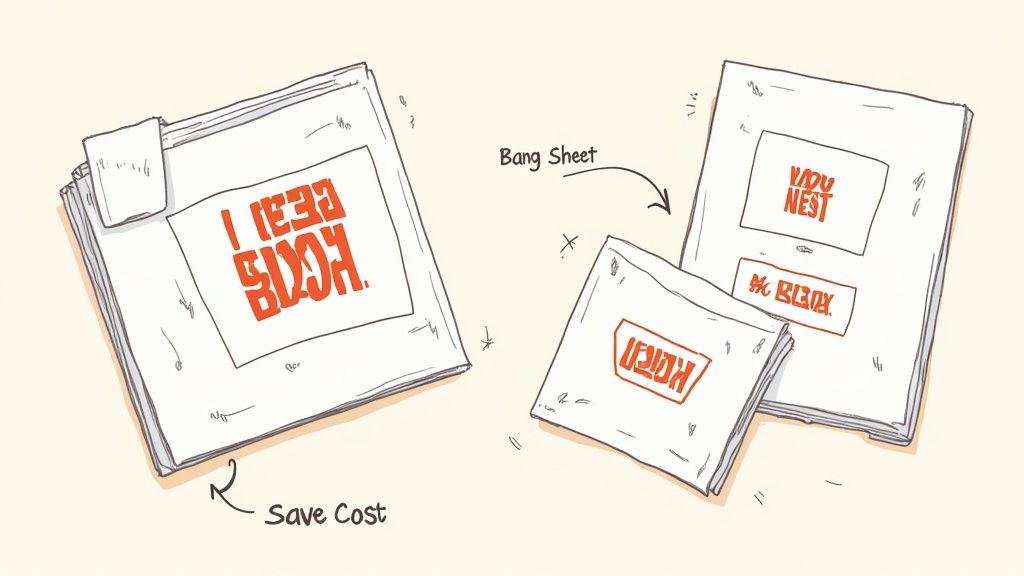
This image nails the concept. By packing your designs in tight, you stop paying for empty space and slash your material costs.
The Art of "Nesting" Your Designs
The key to really unlocking the power of gang sheets is a technique called nesting. Think of it like playing Tetris with your artwork. Your goal is to arrange all your different designs onto one sheet so that there's almost no wasted space left.
Say you have an order with big full-back graphics, a few medium front prints, some small pocket logos, and a couple of tiny sleeve designs. Instead of running each of those separately, nesting lets you tuck the smaller pieces into the blank areas around the larger ones. It's this smart use of real estate that drives your per-transfer cost way down.
Nesting isn't just a space-saving trick—it's a profit strategy. Every square inch of film you don't waste is money that stays in your pocket, boosting your margins on every single shirt you sell.
This kind of efficiency is exactly why the custom T-shirt market is blowing up. In fact, experts predict the industry will grow by $2,226 million between 2025 and 2029, with a steady growth rate of 7.7%. That growth comes from being able to offer a variety of shirt design sizes without breaking the bank, which is something gang sheets make incredibly easy. You can read more about industry trends like this over on Printful.com.
Forget Manual Layouts—Use the Auto-Build Gang Sheet Builder
Trying to manually arrange a dozen different designs to create a perfectly nested gang sheet is a headache. It's a tedious process of measuring, rotating, and nudging things around to make sure nothing overlaps. This is precisely why we created our Auto-build gang sheet builder. It makes the whole process fast, easy, and practically foolproof for ultimate ease of use and cost-effectiveness.
Our tool handles all the heavy lifting for you. Just upload your finished design files, and the builder gets to work.
- Smart Nesting: The software automatically analyzes the shape and size of each design, arranging them in the most efficient layout to maximize every inch of film.
- Live Cost Calculation: As you add or remove files, the builder updates the price in real-time. No surprises, just total control over your costs.
- No More Guesswork: Stop worrying about leaving enough space for cutting. The builder ensures everything is perfectly spaced for easy cutting and pressing.
The system automatically places each design to create a layout that’s ready for the press, saving you time and guaranteeing you get the best possible price. For a deeper dive, check out our complete guide on how to use DTF gang sheets. It’s the smartest way to order your transfers, whether you're just starting out or running a full-scale print shop.
Your Final Checklist Before You Print
Before you hit that final "submit" button, it pays to do one last pre-flight check. Taking just a minute here can be the difference between a perfect print run and a costly, frustrating mistake. Think of this as your last line of defense, making sure all your hard work pays off.
We’ve boiled down the most critical lessons from this guide into a simple checklist. Running through these points ensures your file is truly press-ready and that your transfers will look exactly like you imagined.
Core File Specifications
First, let's lock down the technical bedrock of your design file. Getting these three things right is non-negotiable for a high-quality DTF print and will stop the most common errors we see dead in their tracks.
- Resolution Check: Is your file set to 300 DPI at the final print size? This is the single most important step for getting a sharp, professional-looking graphic.
- Color Mode Confirmation: Did you design and save your file in CMYK color mode? This is crucial for making sure the colors you see on screen are as close as possible to the final printed product.
- Background Transparency: Is the background of your design actually transparent? Double-check that you've saved it as a PNG or another compatible format to avoid printing an unwanted solid box around your art.
Design and Layout Verification
Next, let’s give the artwork itself a once-over. These checks are all about the content of your design and how it’s going to look on the final garment.
One of the easiest mistakes to make is forgetting to convert your text to outlines. This simple step locks the font into a shape, guaranteeing it prints perfectly every time, no matter what fonts the printer has installed.
- Text to Outlines: Have all your fonts and text elements been converted to outlines or curves? This completely prevents font substitution errors.
- Placement Dimensions: Have you double-checked that your shirt design size actually matches the dimensions for its intended spot (e.g., left chest, full back)?
- No Stray Pixels: Zoom way in and scan the edges of your design. Are there any stray pixels or unwanted marks hanging around?
Final Order Optimization
Finally, let’s make sure you’re getting the most value out of your order. This is where smart choices can directly impact your bottom line and make your life easier. A huge part of this is how you arrange multiple designs.
For maximum cost effectiveness and ease of use, there’s no better tool than our Auto-build gang sheet builder. Instead of uploading a bunch of individual files, just drop everything in at once. The tool automatically nests your different designs, optimizing every single square inch of the film for you. It’s the simplest way to lower your cost per print and streamline your entire workflow.
Sizing Questions We Hear All The Time
Even with a solid guide, real-world projects always throw a few curveballs. This is where we tackle the questions that pop up when you're in the middle of designing, giving you straight answers so you can get back to creating.
Think of this as a cheat sheet for handling those tricky situations, from working with today’s trendy oversized styles to figuring out how to rescue a less-than-perfect image file.
How Should I Size Designs for Oversized or Streetwear Shirts?
Sizing for oversized and streetwear fits is a whole different ballgame. Your standard chest print dimensions can look tiny and out of place on a shirt designed with a relaxed, boxy cut. You have to scale everything up to match the garment's bigger canvas.
For a full-front graphic on an oversized tee, don't hesitate to push the width to 12-15 inches. This ensures the art has the right impact and doesn't get lost. Pay close attention to the shirt's specific construction, too. A drop-shoulder tee, for instance, gives you a much wider, uninterrupted space to work with across the chest.
What Can I Do if My Image Is Low Resolution?
Finding the perfect graphic only to realize it's low-res is a classic headache. Just blowing it up in your design software won’t work—you’ll get a blurry, pixelated mess. The only real fix is to vectorize the image.
Vectorizing essentially traces the original pixel-based art and recreates it as a scalable graphic made of clean lines and shapes. This method is perfect for logos, text, and graphics with solid colors. While there are online tools that can get the job done, having a designer do it manually is often best for more detailed artwork. It's the only way to guarantee a crisp, professional print from a low-quality file.
Can I Mix Different Art Styles and Sizes on One Gang Sheet?
Yes, you absolutely can! In fact, that's the whole point of a gang sheet. You can—and should—mix all kinds of artwork together. Throw a detailed, full-color back piece right next to a dozen simple, one-color pocket logos. The DTF process handles it all in a single run.
This flexibility is what makes gang sheets such a powerful money-saver. Speaking of getting the fit right, if you're looking for a deeper dive into garment dimensions, guides on how to take body measurements for clothes can be incredibly helpful for ensuring your designs land perfectly.
The secret to a great gang sheet is nesting—fitting your designs together like puzzle pieces to use every last bit of film. This tactic seriously drops your cost per print, letting you produce a huge variety of designs in one super-efficient order.
To make this dead simple, our Auto-build gang sheet builder is the tool you need. It automatically arranges your designs to be as cost-effective as possible for maximum ease of use, no guesswork required, and shows you the price as you go. It’s the smartest way to order your transfers.
Ready to create stunning, perfectly sized prints without the hassle? The team at Lion DTF Transfers is here to help. Our advanced printing technology ensures your designs are vibrant and durable, wash after wash. Start your order today!