


So, what exactly is halftone screen printing? Think of it like a newspaper photograph. From a distance, you see a smooth, detailed image with all sorts of shades. But if you look closely, you'll see it's made up of tiny little dots.
That's the core idea. Halftones use a pattern of small dots to recreate images with gradients and tonal shifts. By changing the size and spacing of these dots, printers can fake the look of different shades or smooth color blends using just a single ink color. It's the secret to turning a photographic image into a printable design.
The Magic of Dots: A Screen Printing Illusion
Imagine you're asked to paint a black-and-white photo, but you only have a bucket of solid black paint. How do you create the soft grays in a cloudy sky or the subtle shadows on someone's face? You can't.
Screen printing has the same problem—it’s designed to lay down solid, flat layers of ink. This is where the brilliant trick of halftones saves the day.
Halftone printing breaks down a continuous-tone image (like a photo) into a grid of individual dots. It’s a complete optical illusion. When you look at the final print from a normal distance, your eyes blend these dots together, and you perceive a complete, smooth image with real depth and shading.
Here's how it works:
- Darker Areas: Use large dots packed tightly together.
- Lighter Areas: Use tiny dots spread far apart.
- Mid-Tones: Use medium-sized dots with balanced spacing.
This simple but effective method allows a screen printer to replicate the rich detail of a photograph or a complex illustration using just one screen and one color of ink.
To help you get a quick handle on the terminology we'll be using, here's a simple reference table.
Key Halftone Terminology at a Glance
This table breaks down the fundamental terms you'll encounter when working with halftones for screen printing. Understanding these concepts is the first step toward mastering the process.
| Term | What It Is | Why It's Important |
|---|---|---|
| Dot Type | The shape of the individual dots (e.g., round, elliptical, square). | The shape affects how tones blend and can prevent unwanted patterns in the final print. |
| Frequency (LPI) | Lines Per Inch, or how many lines of dots fit into one inch. | LPI determines the detail and resolution of the print. Higher LPI means finer detail. |
| Angle | The angle at which the grid of dots is printed. | Using the correct angle is crucial for preventing moiré patterns, especially in multi-color prints. |
| Dot Gain | The tendency for printed dots to expand or "grow" on the substrate. | Factoring in dot gain is essential for achieving accurate tonal reproduction in the final print. |
Think of these terms as your core vocabulary. Once you're comfortable with them, you'll be able to troubleshoot and perfect your halftone prints with much more confidence.
A Quick Look Back: The History of the Halftone
This concept isn't some new-fangled digital trick; it's been a cornerstone of print media for over a hundred years. The halftone process, which truly changed image reproduction, dates all the way back to the late 19th century.
It was a German inventor named Georg Meisenbach who patented a commercially successful halftone screen process in 1882. His method used rotated screens to create the cross-lined dot patterns needed for practical printing. For the first time, this breakthrough allowed newspapers and magazines to mass-produce detailed images. If you want to dive deeper into the history, Getty.edu has a great write-up on the evolution of the halftone process.
Key Takeaway: Halftones aren't just a technique; they are the bridge between digital photos and physical screen printing. They translate the language of pixels and gradients into a pattern of solid ink dots that a screen can actually reproduce.
Why This All Matters for Your Prints
Getting a handle on halftones is the first real step toward producing professional-grade apparel. It opens up a whole new world beyond simple text and blocky graphics, letting you tackle photorealistic prints, artistic shading, and incredibly intricate designs. While there are a few technical details to learn, mastering this makes even the most intimidating jobs feel achievable.
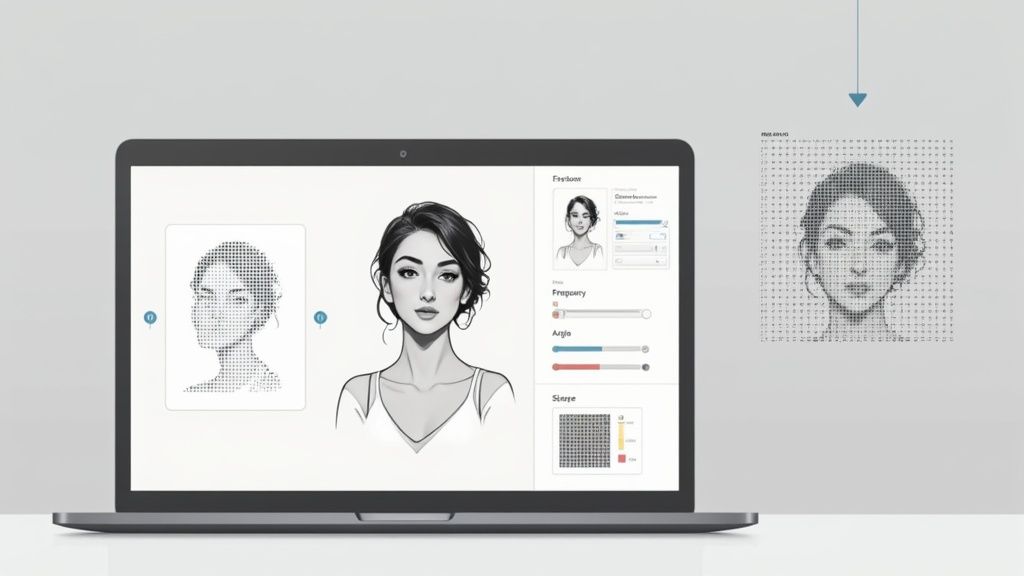
It also makes you a much more efficient printer. For example, once you're comfortable with halftones, you can start grouping multiple designs together on a single screen to save time and materials. Our Auto-build gang sheet builder makes this incredibly simple and cost-effective, helping you maximize your film and reduce setup time. It's a smart approach for any print shop.
Mastering the Four Pillars of Halftone Prints
Alright, let's move from the "what" to the "how." To nail a perfect halftone print, you need to get a handle on four key variables. Think of them as the foundational pillars holding up your entire design. Getting them right isn't magic; it’s a deliberate process that turns a digital concept into a crisp, professional-looking screen print.
These four elements—Dot Shape, LPI, Angle, and Dot Gain—all work together. Once you understand each one, you gain the power to troubleshoot problems before they even happen and make sure your final product looks exactly like you imagined it on screen.
This diagram breaks down how a solid image is converted into dots of different sizes to create the illusion of tone.

As you can see, darker areas are made with big dots packed closely together, while lighter areas use tiny dots with more space between them. That's the core principle of creating tonal variation with halftones.
Choosing Your Dot Shape
The first pillar is the shape of the dots themselves. This might seem like a tiny detail, but the geometry of your dots has a real impact on the final look and feel of your print.
You'll mainly run into three shapes:
- Round Dots: The most common and versatile choice. They're great for general-purpose printing but can sometimes create a noticeable "chain" effect where the dots connect in the mid-tones, which isn't always ideal.
- Elliptical Dots: These oval-shaped dots are often the preferred choice because they create much smoother tonal transitions. Since they connect at two points instead of one, they help reduce that harsh visual jump from mid-tones to shadows.
- Square Dots: Less common in apparel printing, square dots give you a more geometric or stylized look. They create a very sharp tonal break when their corners touch, which can be useful for certain artistic effects but isn't great for photorealistic prints.
For most halftones screen printing jobs, elliptical dots will give you the smoothest gradients, making them a safe and effective place to start.
Lines Per Inch (LPI): The Key to Detail
Lines Per Inch, or LPI, is all about the resolution of your halftone. It tells you how many lines of dots are packed into one linear inch. A higher LPI means smaller, more numerous dots, which translates to finer detail. A lower LPI uses larger, more obvious dots, creating a coarser, more stylized look.
The history of print media gives us a perfect real-world example. Newspapers traditionally used coarse screens around 50 to 85 LPI for speed and cost, while high-quality magazines used finer screens from 100 to 120 LPI to get those sharp, crisp images. If you want to dive deeper into the history, Britannica offers some cool insights on the halftone process.
Crucial Insight: Your LPI choice is directly tied to your screen mesh count. A solid rule of thumb is that your mesh count should be 4 to 5 times your LPI. This ensures the mesh can properly support the tiny dots. For example, a 45 LPI design would print beautifully on a 200-230 mesh screen.
Screen Angle: Preventing Unwanted Patterns
The third pillar is the angle of the halftone grid itself. You can't just print your dot pattern straight up and down (at 0 or 90 degrees). Why? Because the dots would line up perfectly with the threads of your screen mesh, causing them to either fall through the holes or get blocked entirely. This interference creates a distracting, wavy pattern called a moiré.
To avoid this headache, the entire grid of dots is rotated. For single-color prints, a standard angle of 22.5 degrees is your best bet. This tilts the dots diagonally to the mesh threads, allowing them to print cleanly between the intersections. For multi-color prints (like CMYK), each color screen gets its own unique angle (e.g., 15°, 45°, 75°, 90°) to keep the different dot patterns from clashing and creating moiré.
Accounting for Dot Gain
Finally, we have dot gain. This is simply the natural tendency for ink to spread out a little bit when it’s pressed through the screen and onto the fabric. A dot that measures 50% on your film might end up covering 60% or 70% of the space on the final shirt. This makes the print look darker and muddier than you intended.
You can't eliminate dot gain—it's just physics—but you can plan for it. It's influenced by a few things:
- Ink Viscosity: Thinner inks will spread more.
- Squeegee Pressure: More pressure forces more ink through the screen, increasing gain.
- Fabric Absorbency: A super-absorbent cotton tee will cause more ink bleed than a slick polyester blend.
The trick isn't to fight dot gain but to compensate for it in your artwork before you even burn a screen. Most design software like Adobe Photoshop lets you account for a predicted dot gain percentage. This feature slightly shrinks the dots in your digital file so that when they inevitably spread during printing, they expand to the perfect size. A good starting point for plastisol ink on cotton is to compensate for about 20-30% dot gain.
Preparing Digital Artwork for Halftone Printing
Transforming a detailed digital image into a screen-printed masterpiece starts way before any ink hits a squeegee. Honestly, the whole process lives or dies by how well you prep your digital artwork. A few extra minutes spent dialing in your file in a program like Adobe Photoshop or Illustrator can save you hours of headaches and wasted materials at the press.
This first stage is all about building a clean, strong foundation for your print. The goal is to convert your design into a print-ready halftone that will burn a crisp, detailed screen. That means tweaking the image's tonal range, carefully picking your halftone settings, and printing a perfectly opaque film positive.
Step 1 Fine-Tuning Your Image for Conversion
Before you even think about creating dots, you have to get the source image ready. A photo that looks amazing on a backlit computer screen won’t necessarily translate well to a t-shirt. The key is to crank up the contrast and really define its lights and darks.
First thing’s first: convert your image to grayscale. This strips out all the color information, letting you focus only on the highlights, shadows, and mid-tones. Use adjustment tools like Levels or Curves to punch up the whites and deepen the blacks, which gives the final print way more impact. If you're working with tricky designs or just need that professional polish, using ecommerce photo retouching services can ensure your artwork is flawless before it ever becomes a halftone.
Pro Tip: Watch out for super subtle gradients. On fabric, very light gray tones (anything below 10%) might not expose correctly on the screen, and super dark tones (above 90%) can just blend into a solid blob because of dot gain. Pushing your tonal range makes sure these delicate areas don't get lost in translation.
This whole digital prep phase has come a long, long way. The jump from old-school photomechanical methods to digital halftone creation really took off in the late 20th century. Early laser printers back in the 1970s had resolutions around 300 dots per inch (dpi), which limited halftone screens to a chunky 65 lines per inch (lpi). By the mid-1980s, new imagesetter technology hitting 600 dpi or more, paired with smarter dithering techniques, allowed printers to output entire pages with text and photo halftones integrated, totally changing the game.
Step 2 Converting to a Halftone Bitmap in Photoshop
Once your image is looking sharp, it's time to actually make the dots. In Adobe Photoshop, this is done by converting the grayscale image into a Bitmap. This process turns every single pixel into either a solid black dot or pure white space—which is exactly what you need to burn a screen.
Here’s the basic workflow:
- Go to Image > Mode > Bitmap.
- In the pop-up box, make sure the Output resolution matches your file's input (like 300 dpi).
- For the Method, you'll want to choose Halftone Screen... from the dropdown menu.
This brings up the Halftone Screen dialog box, where you'll plug in the "four pillars" we talked about earlier:
- Frequency (LPI): This sets the level of detail. For t-shirts, a range of 35-55 LPI is a pretty safe bet.
- Angle: Stick with 22.5 degrees for single-color jobs. This is the secret to avoiding weird moiré patterns.
- Shape: Elliptical dots are usually the best choice for creating smooth, natural-looking gradients.
Click OK, and Photoshop will transform your image into a pattern of pure black dots. This file is now ready to be printed onto your film positive.
Step 3 Creating Scalable Vector Halftones in Illustrator
What if your design needs to be resized without getting all pixelated? For that, Adobe Illustrator is your best friend. Instead of making a pixel-based bitmap, you can create a vector halftone, where every single dot is a scalable shape.
While Illustrator has some built-in effects, a lot of screen printers rely on plugins like Astute Graphics' Phantasm or other scripts that give them more control over the dot shape, size, and pattern. The real advantage here is flexibility. A vector halftone can be blown up for a huge back print or shrunk down for a tiny pocket logo, all without losing a bit of quality—something you just can't do with a bitmap file.
Step 4 Outputting an Opaque Film Positive
The last step is also the most important: creating the film positive. This is just a transparent sheet with your halftone design printed on it in solid, light-blocking black ink. The opacity of this film is absolutely non-negotiable.
If light can sneak through the black areas of your film, it will partially expose the emulsion on your screen. This leads to a nightmare scenario of under-cured screens, dots washing out down the drain, and a weak, unusable stencil.
Make sure your printer is on its highest quality setting and that you're using ink specifically made for film positives. When you hold your finished film up to a light, those black dots should be completely solid, blocking everything. A perfect film positive is the blueprint for a perfect screen, and that leads to a perfect print.
Getting this whole process right, from the digital file to the final film, is the foundation of great halftones screen printing. But if you're looking for an alternative that skips the screens entirely, you might want to check out our guide on making custom heat transfer designs and dive into the world of DTF printing.
Getting your digital file perfect is only half the battle. You can spend hours dialing in the perfect halftone art, but if it doesn't translate to a physical screen, all that hard work is for nothing. The whole game hinges on the relationship between your art's LPI and your screen's mesh count.
Think of your screen mesh like a net. It has to be fine enough to actually hold the tiny emulsion dots that form your image. If the holes in the net are too big, the dots will just fall right through or get distorted when you're washing out the screen. It's a simple concept, and luckily, there's a simple rule to guide you.
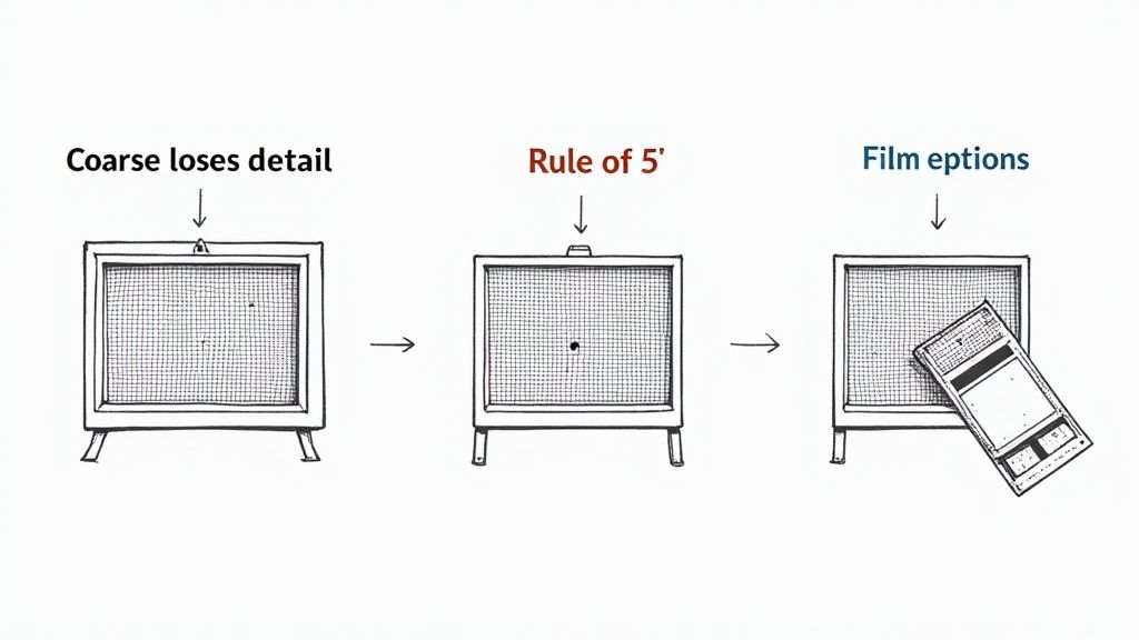
The Rule of 5 Explained
To make sure your screen can physically support the detail in your design, just follow the "Rule of 5." It’s a tried-and-true formula in the screen printing world that says your mesh count should be about five times higher than your LPI.
Mesh Count ÷ 5 ≈ Ideal LPI
Let's make that real. Say you're using a standard 230 mesh screen. Divide that by five, and you get 46. This tells you that an LPI of around 45 is the sweet spot for that screen. This simple bit of math ensures the threads of the mesh create a solid foundation for the emulsion bridges that form your dots, preventing them from blowing out during washout.
Getting this pairing wrong causes immediate problems:
- Mesh Too Coarse: If you try to burn a 45 LPI design onto a 110 mesh screen, the openings are just too large. Your tiny halftone dots won't have anything to hold onto, and you'll lose a huge amount of detail as soon as water hits the screen.
- Mesh Too Fine: On the flip side, pushing a 45 LPI design onto a 305 mesh screen can cause ink to clog up. The mesh openings might be too small for thicker plastisol ink to pass through easily, leaving you with a faded, starved-looking print.
Perfecting Your Screen Exposure
Once you’ve got the right screen, it’s time to head to the darkroom. Proper screen exposure is what turns your film positive into a tough, ink-ready stencil. The goal is simple: harden the emulsion everywhere except where your opaque black dots are blocking the UV light.
The two things that will make or break your exposure are a flawless emulsion coat and tight film-to-screen contact. An uneven coat of emulsion will expose inconsistently—thin spots burn too fast, thick spots stay soft. And if there's any gap between your film and the screen, light will creep underneath, softening the edges of your dots and killing the sharpness of your print. A vacuum exposure unit is best, but heavy weights can also work to ensure everything is pressed tight and flush.
Dialing in Your Exposure Time
Finding the perfect exposure time is all about calibration. Every shop's setup is a little different—your light source, emulsion type, and bulb distance all play a role. An exposure calculator is your best friend here. It’s a simple tool that lets you test a range of timings all on one screen to find that perfect sweet spot.
Under-exposure is probably the most common mistake for printers new to halftones. If the screen doesn't get enough light, the emulsion won't harden properly. As soon as you start washing it out, all those delicate little halftone dots will peel right off and go down the drain. You're left with a screen that's totally useless.
Over-exposure, on the other hand, is when UV light starts to wrap around the edges of your dots, hardening emulsion that should have stayed soft. This effectively shrinks your dots. You'll lose the finest details, especially in your highlights, which completely crushes the tonal range of your final print. Nailing that perfect balance is everything when it comes to capturing the detail from your film.
Working Smarter with Gang Sheets
Efficiency is the engine that drives a profitable print shop. Once you get the hang of prepping individual halftone designs, the next logical step is to make your whole production workflow leaner and meaner. One of the best ways to save a serious amount of time and material is by using gang sheets.
Instead of burning an entire screen for one little chest logo, a gang sheet lets you pack multiple jobs onto a single film. You could group several different halftone designs, throw in a few test prints with different LPI settings, or even combine orders for totally different clients. This approach immediately cuts down on your setup costs for films, emulsion, and screen prep. Our easy-to-use Auto-build gang sheet builder streamlines this process, ensuring you get the most out of your materials in the most cost-effective way.
Maximizing Every Inch of Film and Transfer
The concept here is simple: stop wasting space. By arranging multiple graphics on one layout, you burn one larger screen instead of several smaller ones. This minimizes your material waste and massively boosts your throughput. What could have been a long series of individual setups becomes one efficient operation that helps you get jobs out the door faster.
By bringing gang sheets into your workflow, you can slash material consumption by up to 75% on certain jobs, which goes straight to your bottom line. It's all about working smarter, not just harder, to boost those profit margins.
Our Auto-build gang sheet builder takes all the guesswork out of this, making it incredibly easy to arrange your designs and squeeze the most value out of every inch of film or transfer material.
Halftones for DTF Transfers: The Modern Twist
Interestingly, the core ideas behind halftones aren’t just for screen printing—they're also relevant in modern methods like Direct-to-Film (DTF). While DTF doesn't use physical screens, the RIP software processing the files often creates a digital halftone pattern in the ink layer. This process, often called rasterization, breaks up solid blocks of color with microscopic gaps.
This trick results in a transfer that feels significantly softer, is more breathable, and is way less prone to cracking after a few washes. If you want to dive deeper into optimizing files this way, you can learn more about building DTF gang sheets in our comprehensive guide. By understanding halftones screen printing, you're already halfway to creating better, more durable DTF prints.
How Halftones Improve DTF Printing
It turns out that the old-school principles behind halftones screen printing have some surprising tricks up their sleeve for the modern print world. This knowledge is a game-changer for Direct-to-Film (DTF) printing, where we can use digital halftones to create transfers that feel dramatically better, breathe more, and even last longer.
With DTF, we're not pushing ink through a physical screen to make dots. Instead, the Raster Image Processing (RIP) software does all the heavy lifting digitally before the printer even touches the film. This process, often called rasterization, strategically punches microscopic holes or gaps into solid blocks of color.
Getting That Softer Hand Feel
One of the biggest wins of using halftone logic in DTF is the massive improvement in "hand feel"—that's industry talk for how the print feels on the shirt. Let's be honest, a solid sheet of DTF ink can feel thick, plasticky, and a bit like a sticker. By rasterizing the image, the RIP software breaks up that solid surface.
Think of it like aerating a lawn. Those tiny, invisible voids allow the fabric underneath to breathe and move. The result is a transfer that feels way softer and lighter, flexing with the garment instead of fighting against it.
By breaking up the ink layer with digital halftones, you not only improve the feel but also the wash durability. This process reduces the internal stress on the transfer, making it far less likely to crack or peel over time.
How to Prep Your DTF Files for Rasterization
To get the best results, you need to set your artwork up for success. While the RIP software handles the technical side of creating the dot pattern, it can only work with what you give it. Garbage in, garbage out.
Here are a few pointers:
- Use High-Resolution Files: Always start with artwork that’s at least 300 DPI at the final print size. This gives the software enough pixel data to create crisp, clean raster patterns without getting muddy.
- Ask for Rasterization: When you're ordering transfers, specifically ask for your design to be rasterized for a softer hand. A lot of professional print shops offer this as a standard option.
- Lean into Gradients and Fades: Designs with soft edges, fades, or distressed textures are perfect for this. The halftoning process naturally blends the ink into the shirt, making those effects look seamless.
This digital approach really gives you the best of both worlds: the clever detail of halftones screen printing mixed with the flexibility of modern DTF technology. If you're curious about how these two powerhouse methods stack up, check out our deep dive on the differences between DTF and screen print transfers. At the end of the day, getting the best print is about borrowing the smartest ideas from every technique available.
Common Questions About Halftones in Screen Printing
Even after you nail down the theory, putting halftones into practice on the press is where the real challenges pop up. Here are some of the most common hurdles printers face and how to clear them.
What Is a Moiré Pattern and How Do I Avoid It?
Ever seen a weird, wavy, almost psychedelic pattern show up in your print where it doesn't belong? That’s a moiré. It’s a distracting optical illusion that happens when the grid of your halftone dots clashes with the woven grid of your screen mesh.
Luckily, you can avoid this clash by being smart with your angles. For a single-color job, setting your halftone angle to 22.5 degrees is a tried-and-true trick. It forces the dots to fall between the mesh threads instead of directly on top of them. For CMYK printing, the standard angles (like Cyan 15°, Magenta 75°, Yellow 90°, and Black 45°) are specifically chosen to prevent the different color dot patterns from fighting with each other and the screen.
Why Are My Halftone Dots Washing Out of the Screen?
It’s a gut-wrenching moment: you go to rinse out your freshly burned screen, and all your tiny, perfect halftone dots wash right down the drain. If this happens, the culprit is almost always under-exposure.
This simply means the emulsion didn't get enough UV light to fully cure and harden around the fine details of your film positive. Those weak, soft dots just can't hold on.
The fix is usually straightforward: bump up your exposure time. An exposure calculator is your best friend here—it takes the guesswork out of finding the sweet spot for your specific setup. Also, make sure your film positive is completely black and sits flush against the screen glass for the sharpest possible stencil.
Can I Print Halftones with Water-Based Ink?
You absolutely can, but you have to play by a different set of rules. Water-based inks are typically thinner than plastisol, which can cause more significant dot gain as the ink spreads into the fabric. You’ll probably need to adjust for this in your artwork beforehand.
The bigger challenge is that water-based ink dries in the screen much faster. Consistency is everything. You have to keep a steady print speed and always use a flood stroke to keep the mesh wet between prints. This simple step keeps those tiny halftone openings from clogging up, ensuring your dots stay sharp and clean from the first shirt to the last.
For complex jobs or when you need to maximize efficiency, remember that planning your film output is key. At Lion DTF, we make this easy with our Auto-build gang sheet builder, which is perfect for organizing multiple designs to save on materials and setup time in a cost-effective way. Explore all your options at https://liondtf.com.